Galápagos Islands
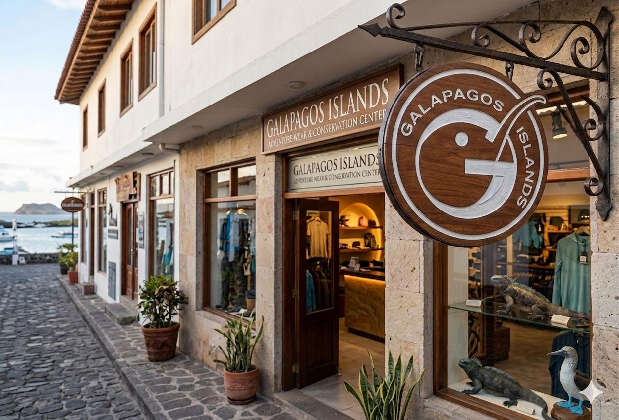
Inspired by the Galápagos Islands, this storefront concept blends coastal retail with conservation. Natural materials, warm wood signage, and open displays reflect sustainability and local identity. Set along a scenic shoreline, it invites visitors to explore eco-friendly apparel and educational exhibits. The goal is to create an immersive experience that merges commerce with environmental awareness, promoting responsible tourism, conservation efforts, and a meaningful connection to the surrounding landscape and wildlife.
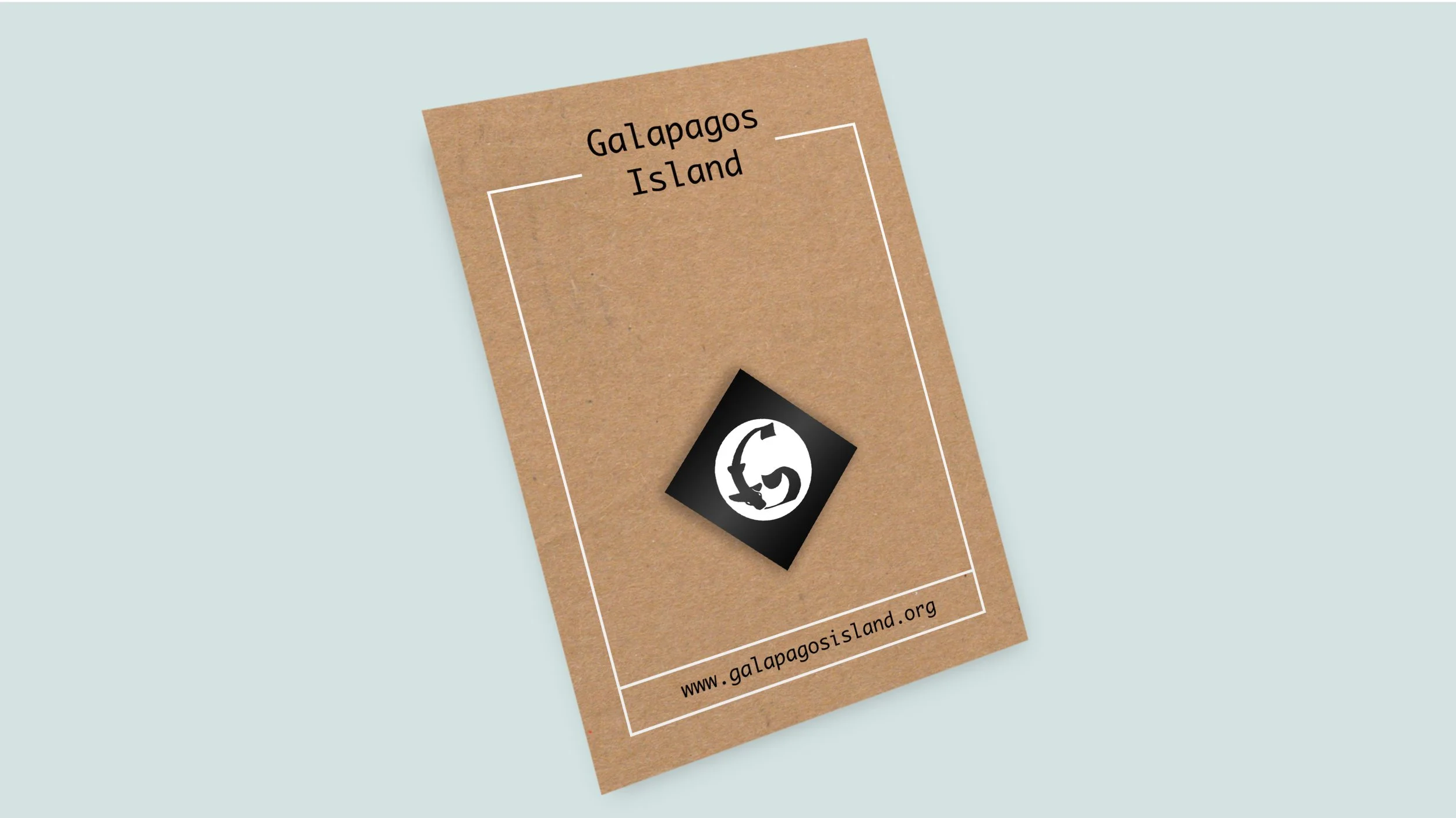
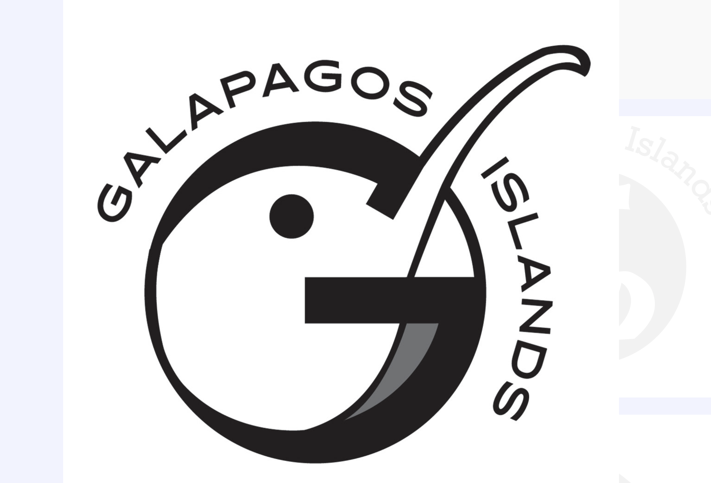
These logo forms inside the “G” directly reference species native to the Galápagos that are vulnerable or endangered nowadays. Instead of depicting them realistically, I embedded them into the letterform to suggest that their identity is inseparable from the islands themselves.
Concept Meaning
MERCH
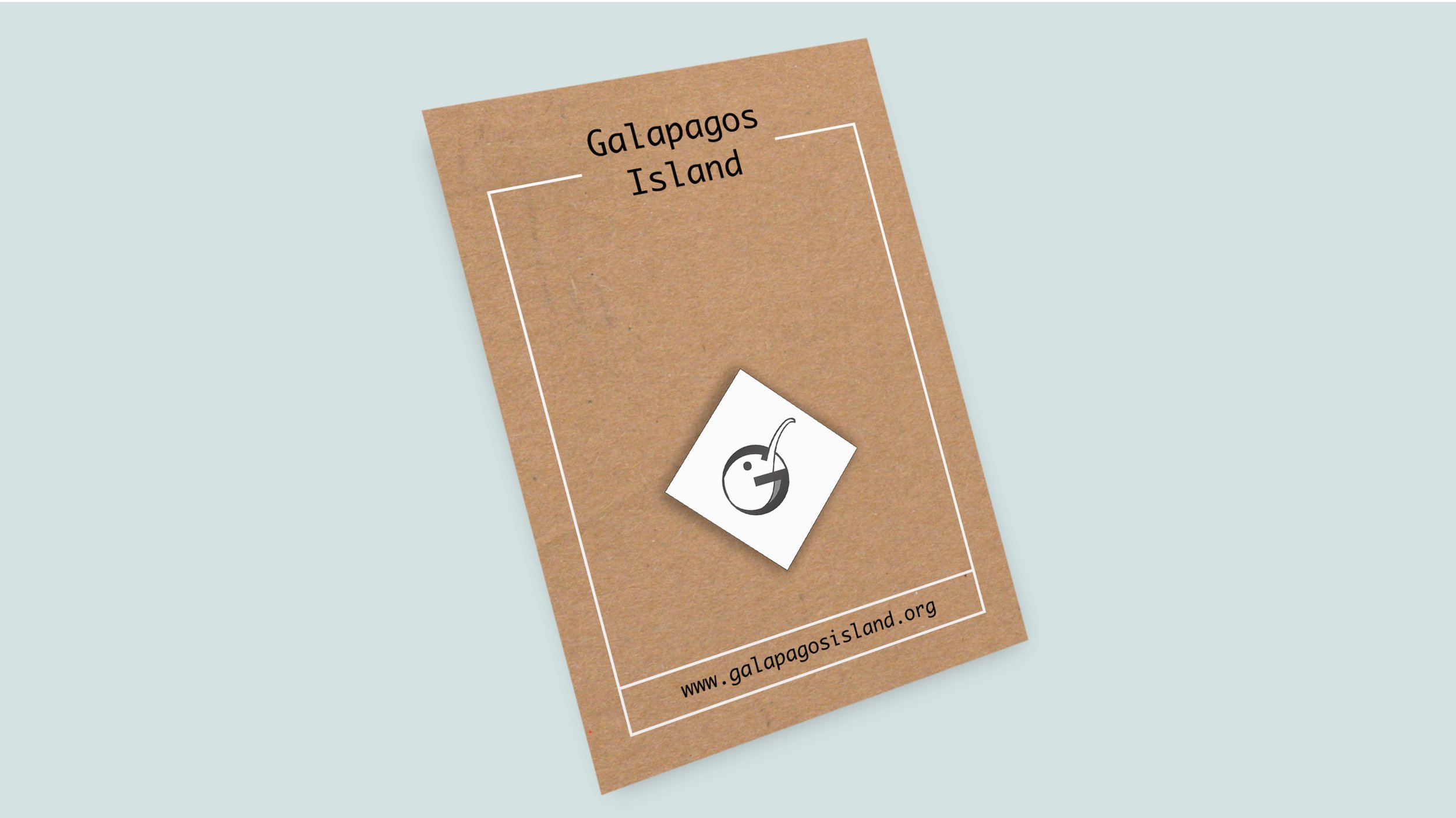
ANIMAL PINS

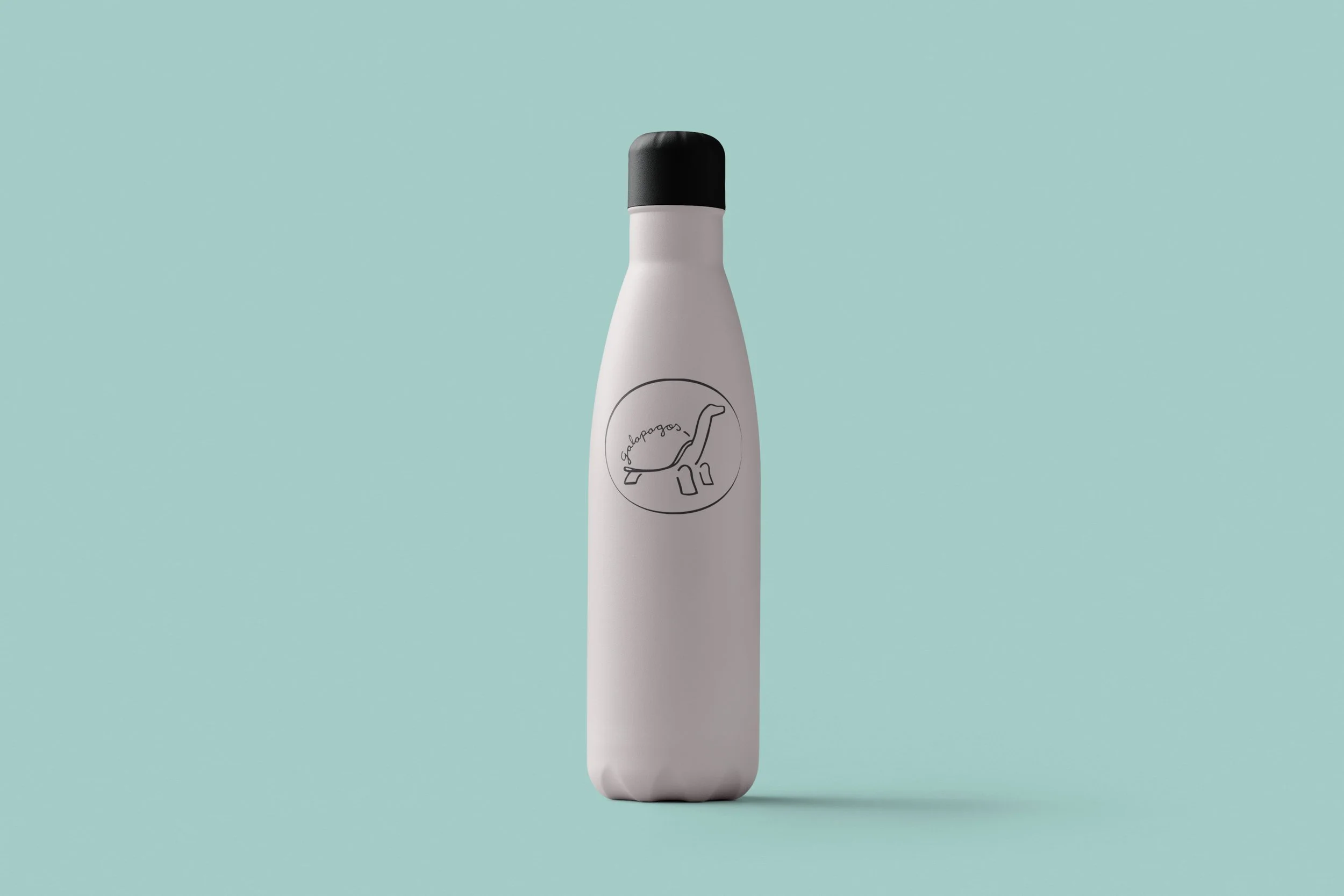
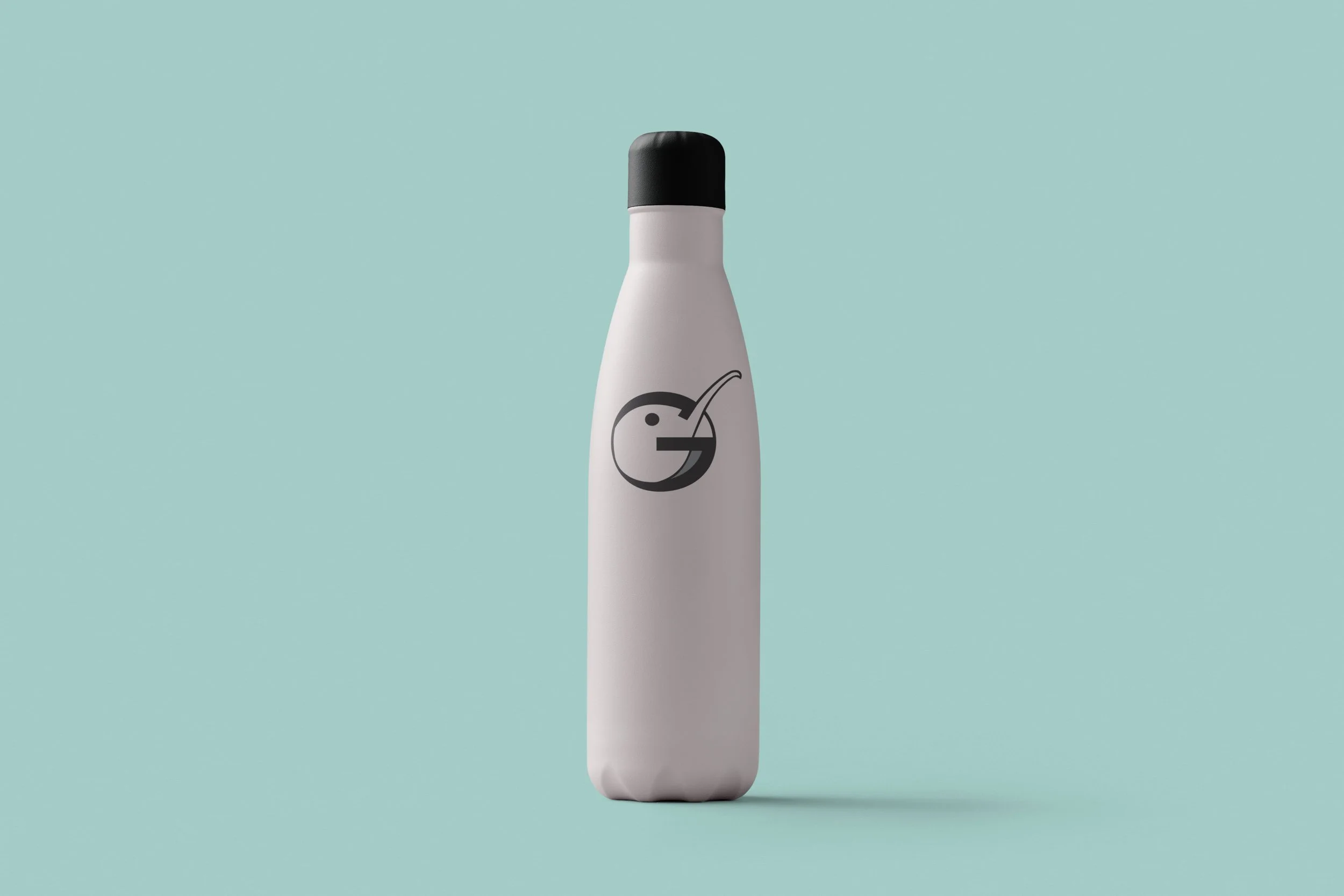
INSULATION BOTTLES 24oz.

Store Front look
Circular shape → represents ecosystems and the fragile balance of nature.
Arrow-like curve → suggests a cycle, but also action—implying conservation efforts and the need to intervene before it’s too late.
Animal silhouettes → highlight specific species at risk, making the logo educational as well as visual.
Black-and-white palette → removes distraction and creates a serious, almost documentary tone, reinforcing the idea of preservation rather than tourism alone.
Symbolism
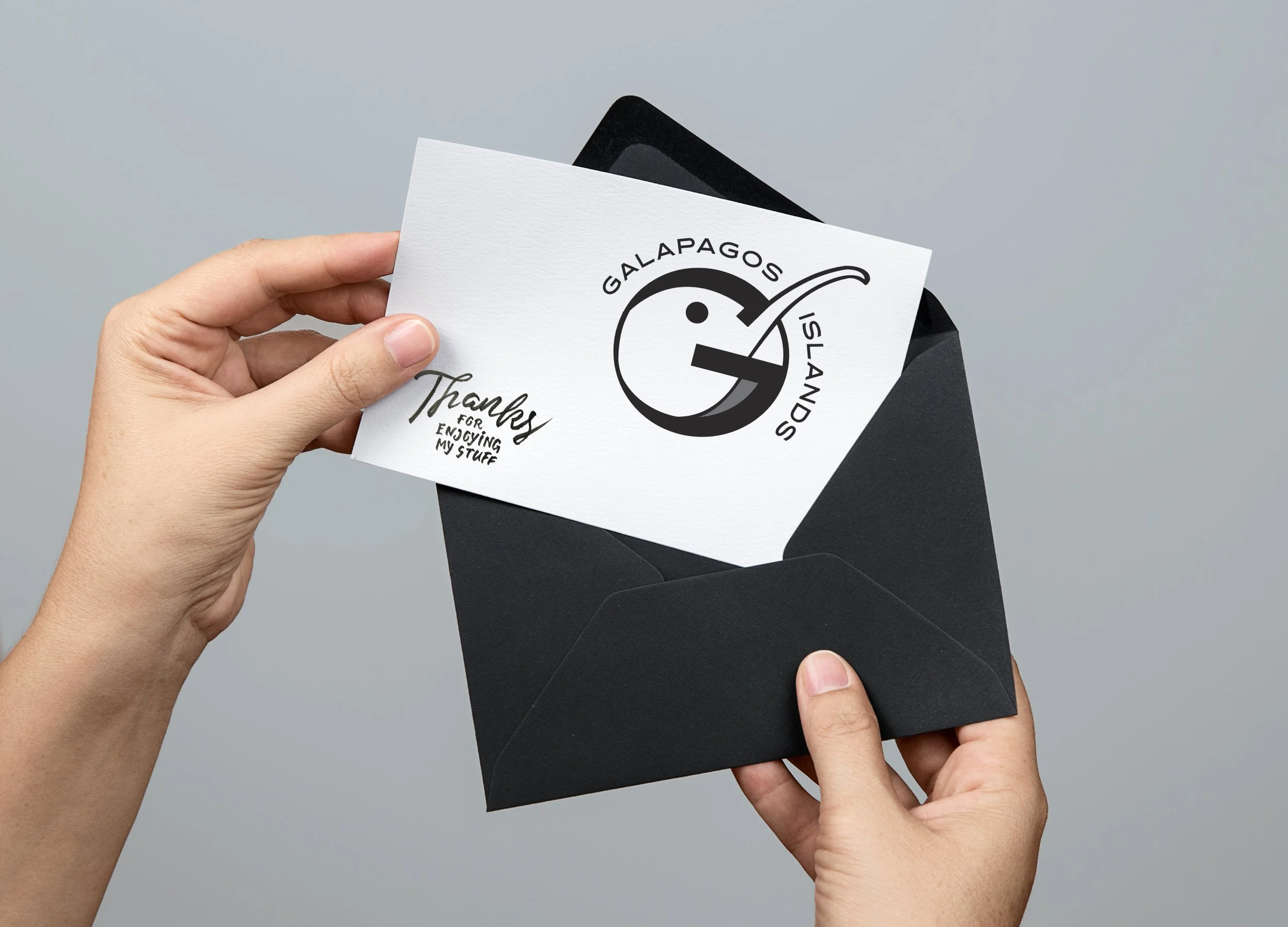
Postcard "Thanks"
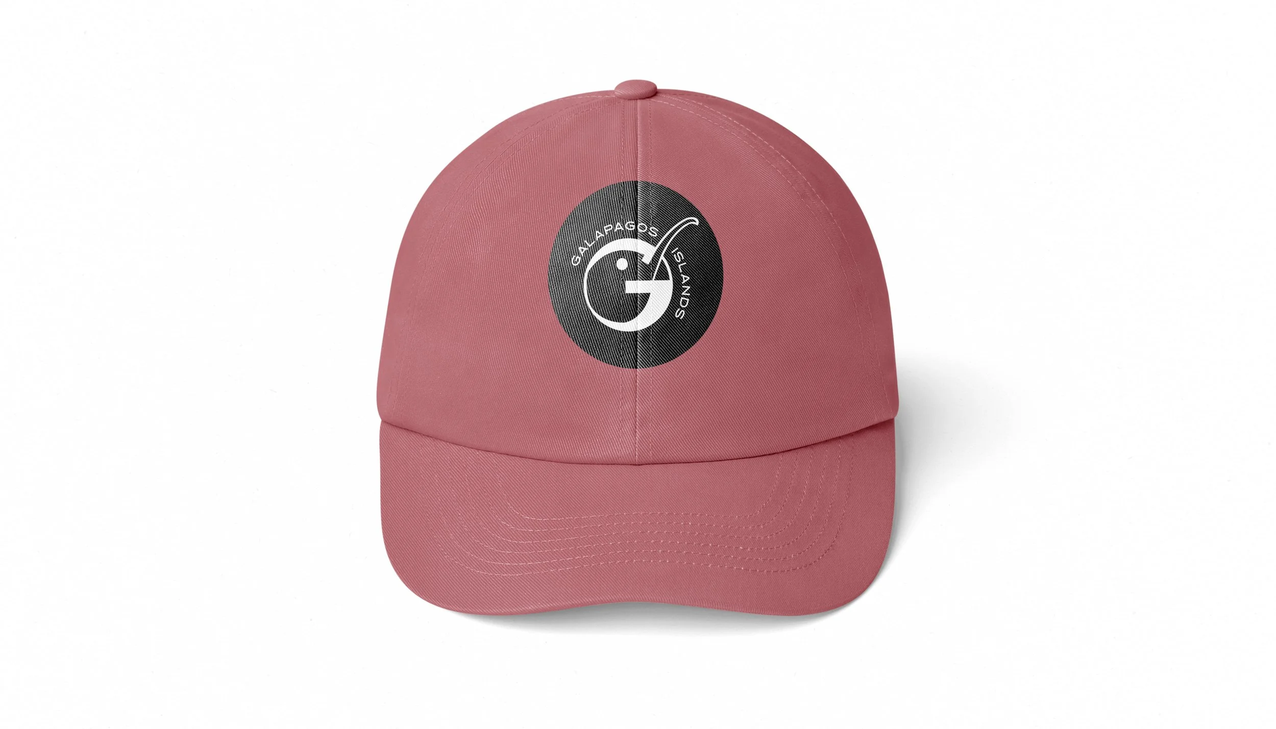
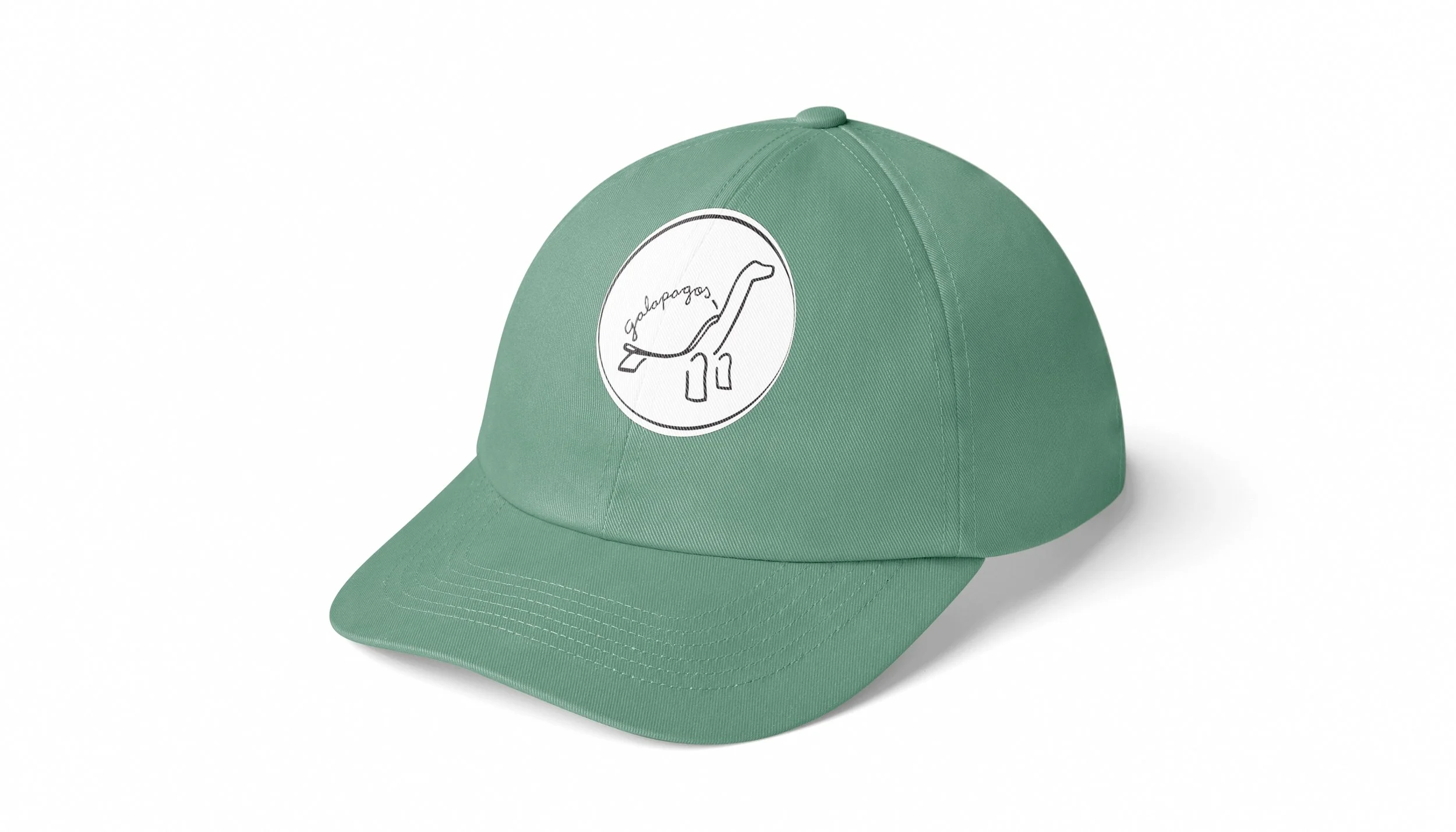
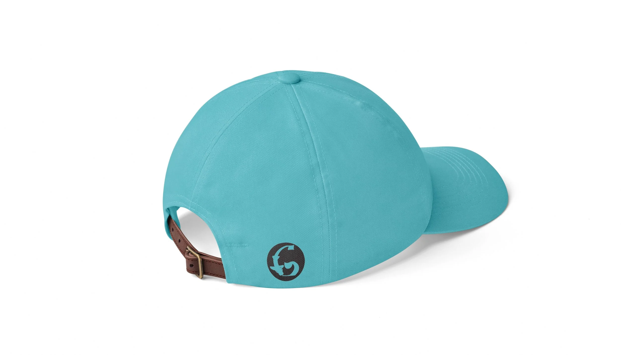
HATS
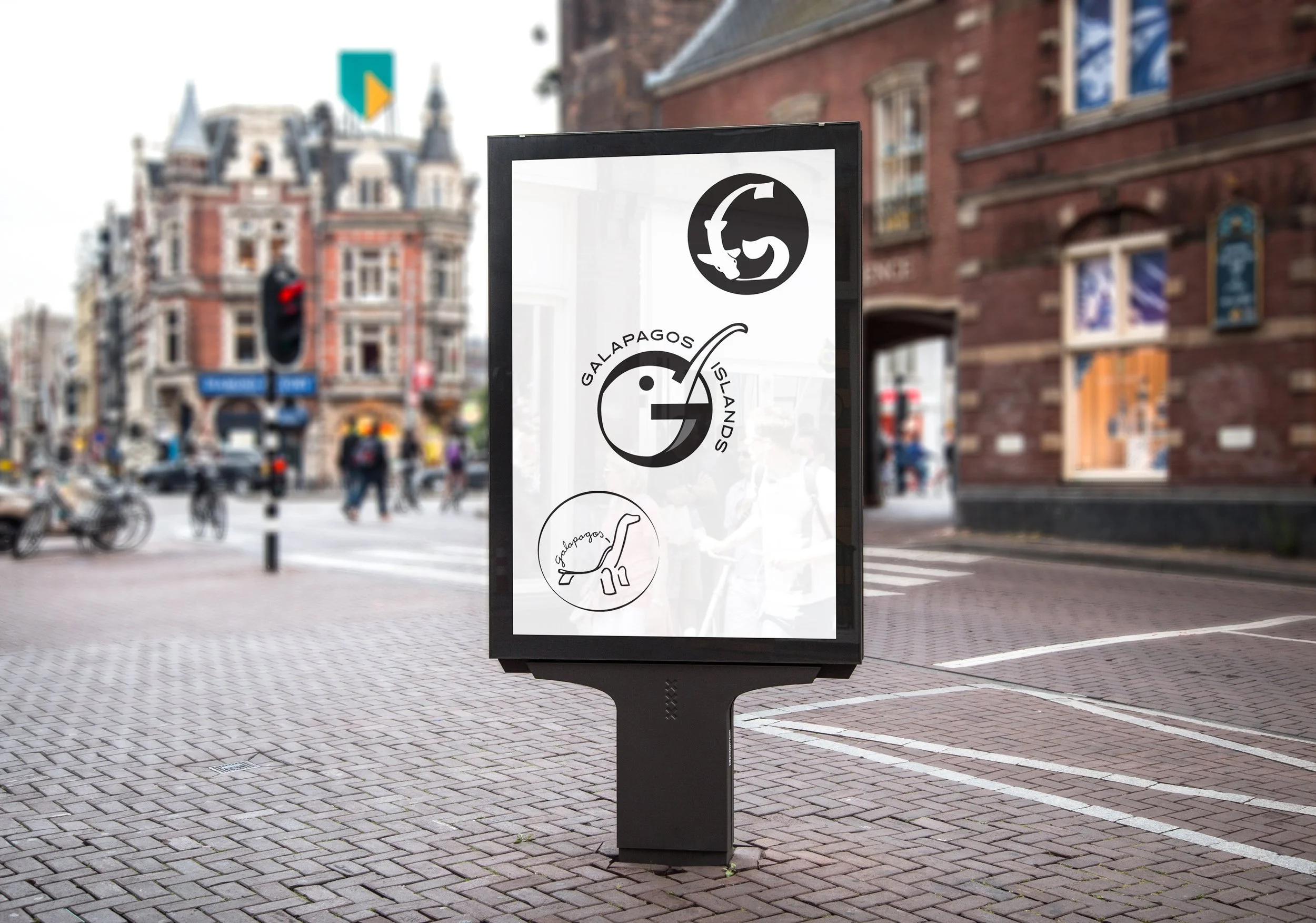
Billboard
Logos
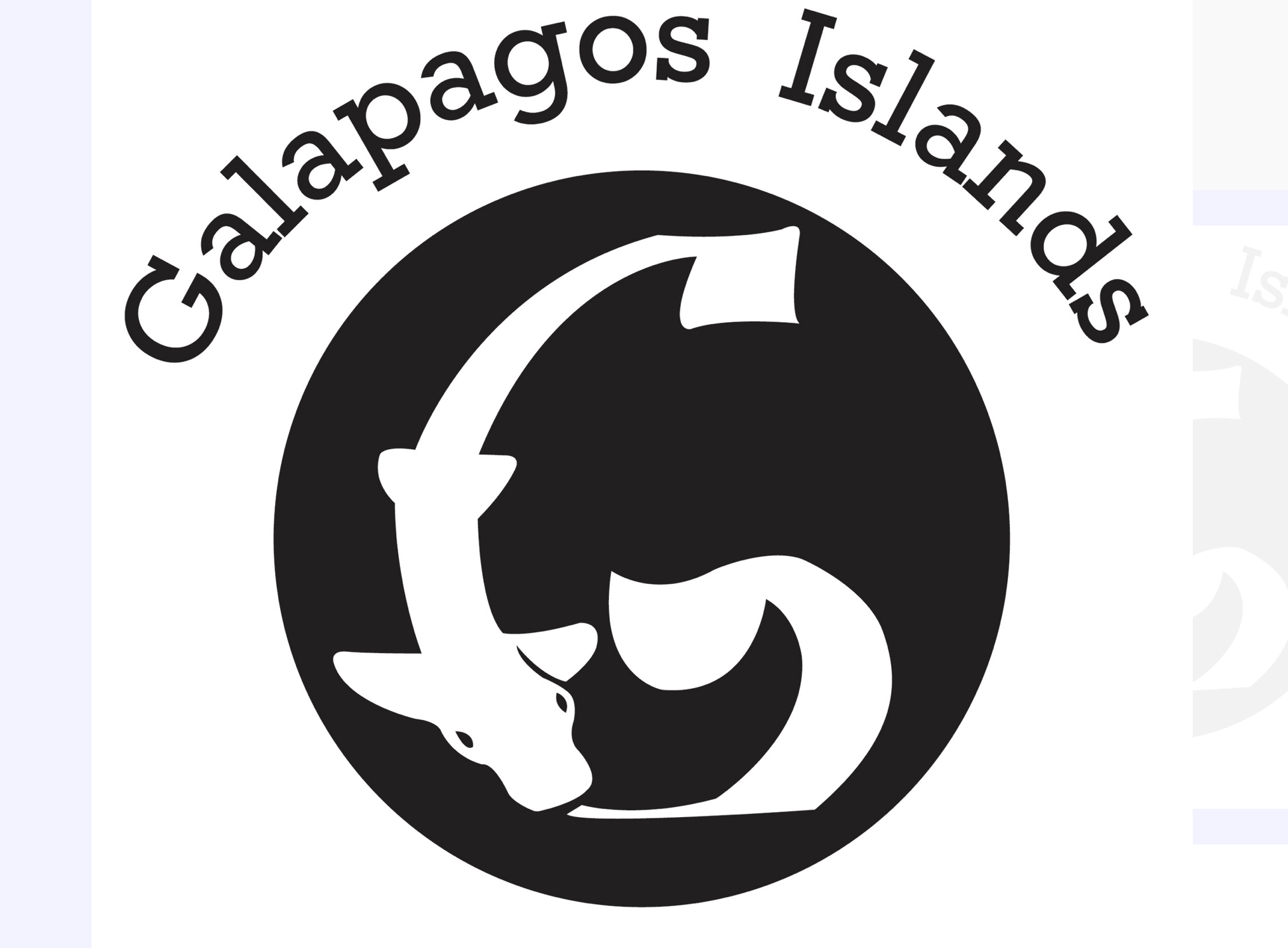
Bullhead Shark

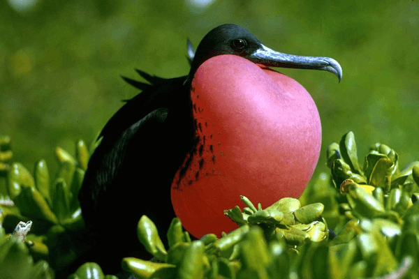
Frigate
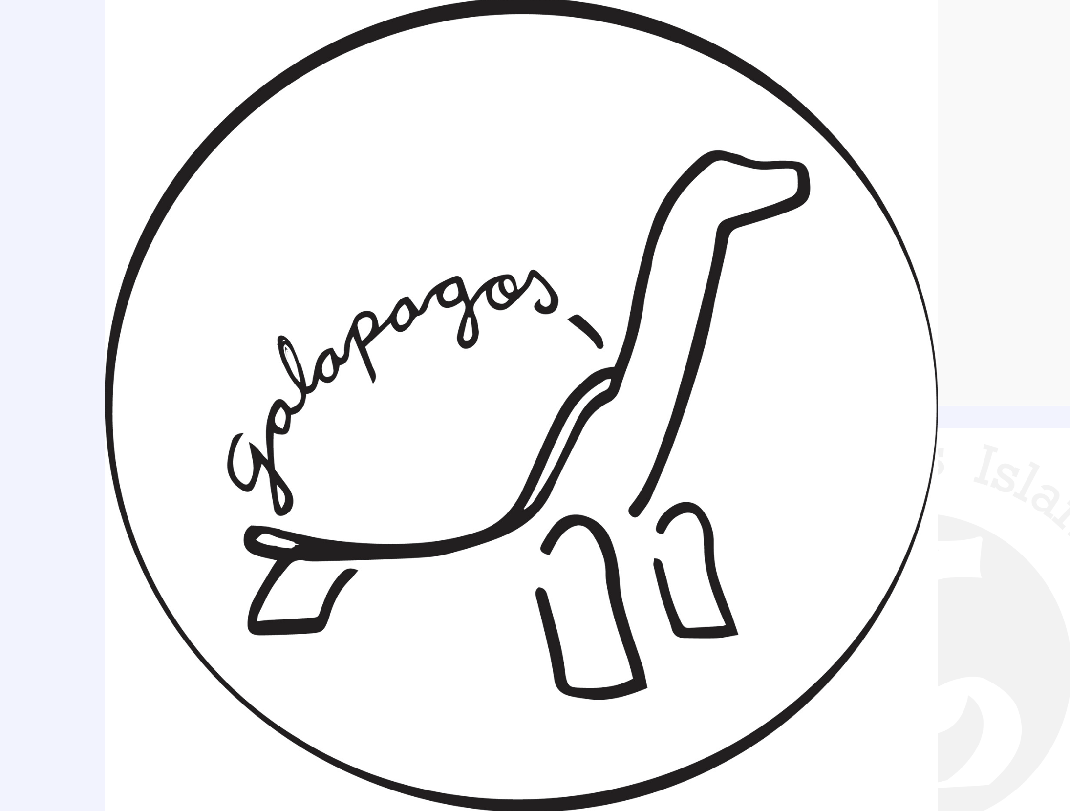
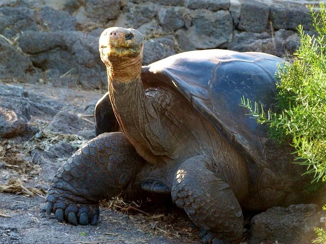
Giant Tortoise