HARMONY CHOCOLATE
Project Overview
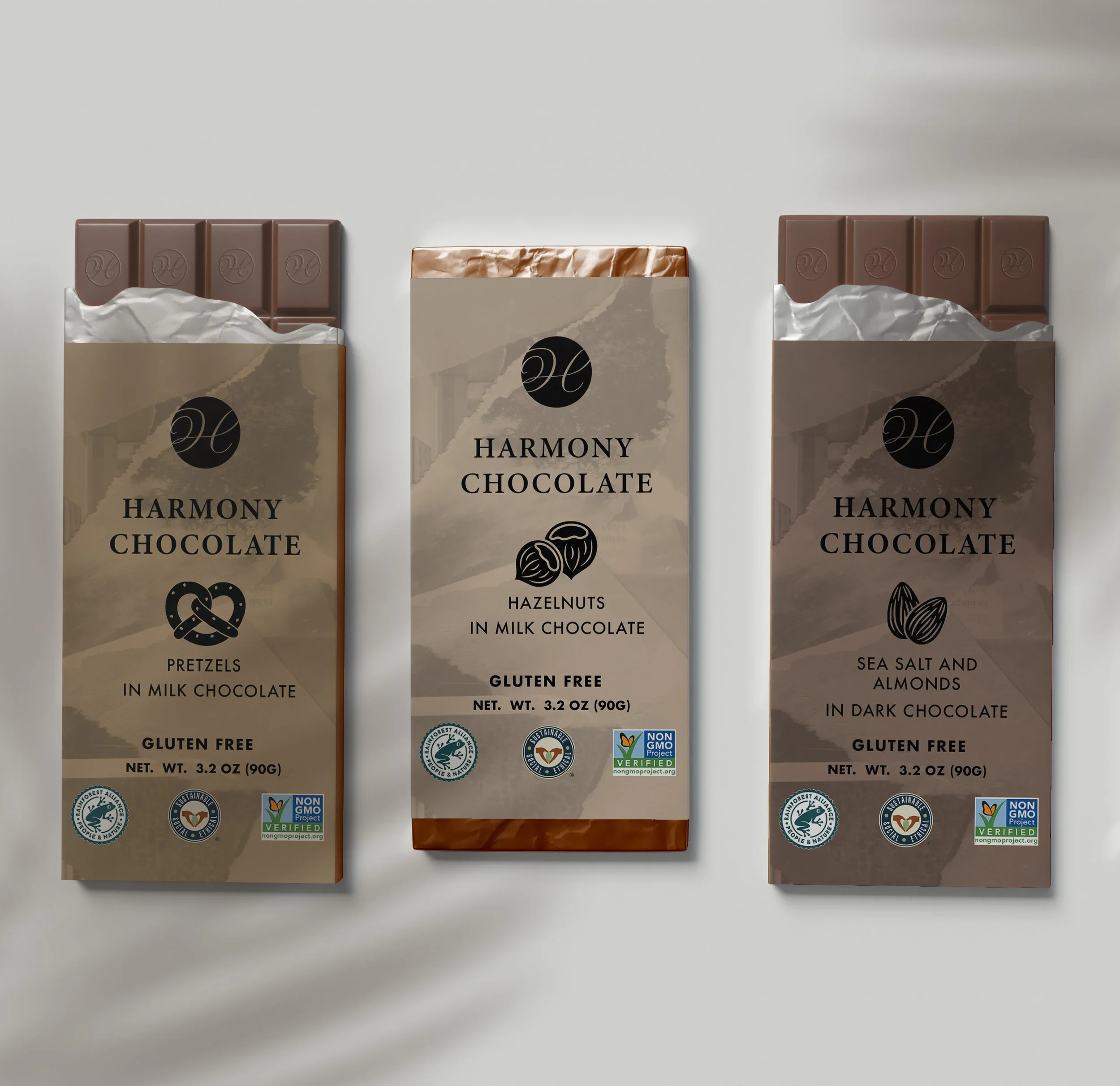
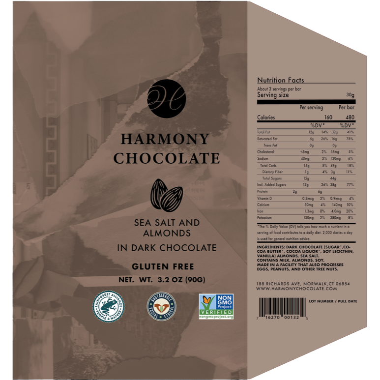
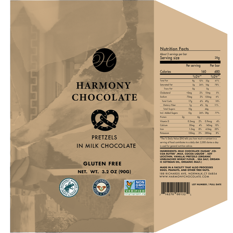
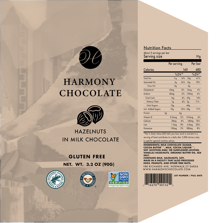
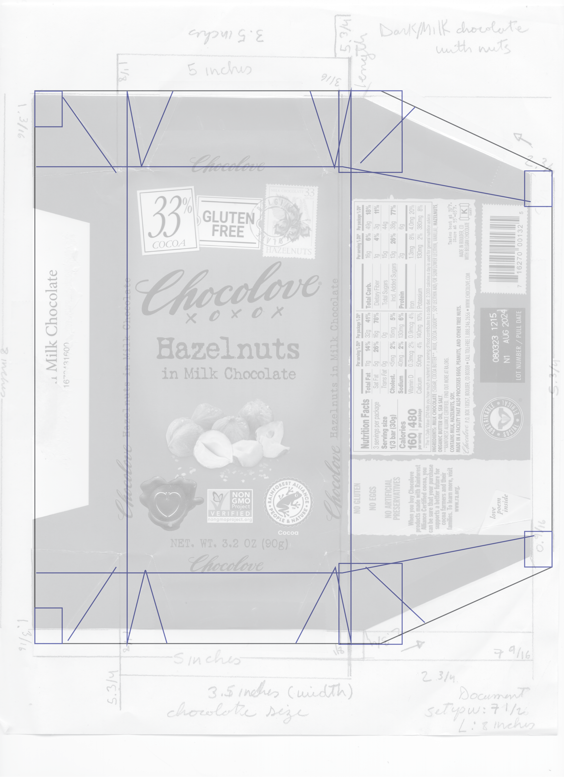
This project focuses on designing a cohesive packaging system for Harmony Chocolate. The goal was to create three chocolate bar wrappers that feel visually consistent while representing different flavors. I followed real-world packaging requirements by including elements like nutrition facts, ingredients, and product information. The concept guiding my design was “simplicity in a dynamic environment,” which I explored through both layout and collage-based visuals.


I worked with
Challenge
The main challenge was balancing creativity with functionality. I needed to design packaging that looked visually engaging while also fitting strict guidelines, such as including all required labeling and maintaining accurate measurements. Another challenge was creating a unified brand system while still allowing each flavor to feel distinct.
Identity
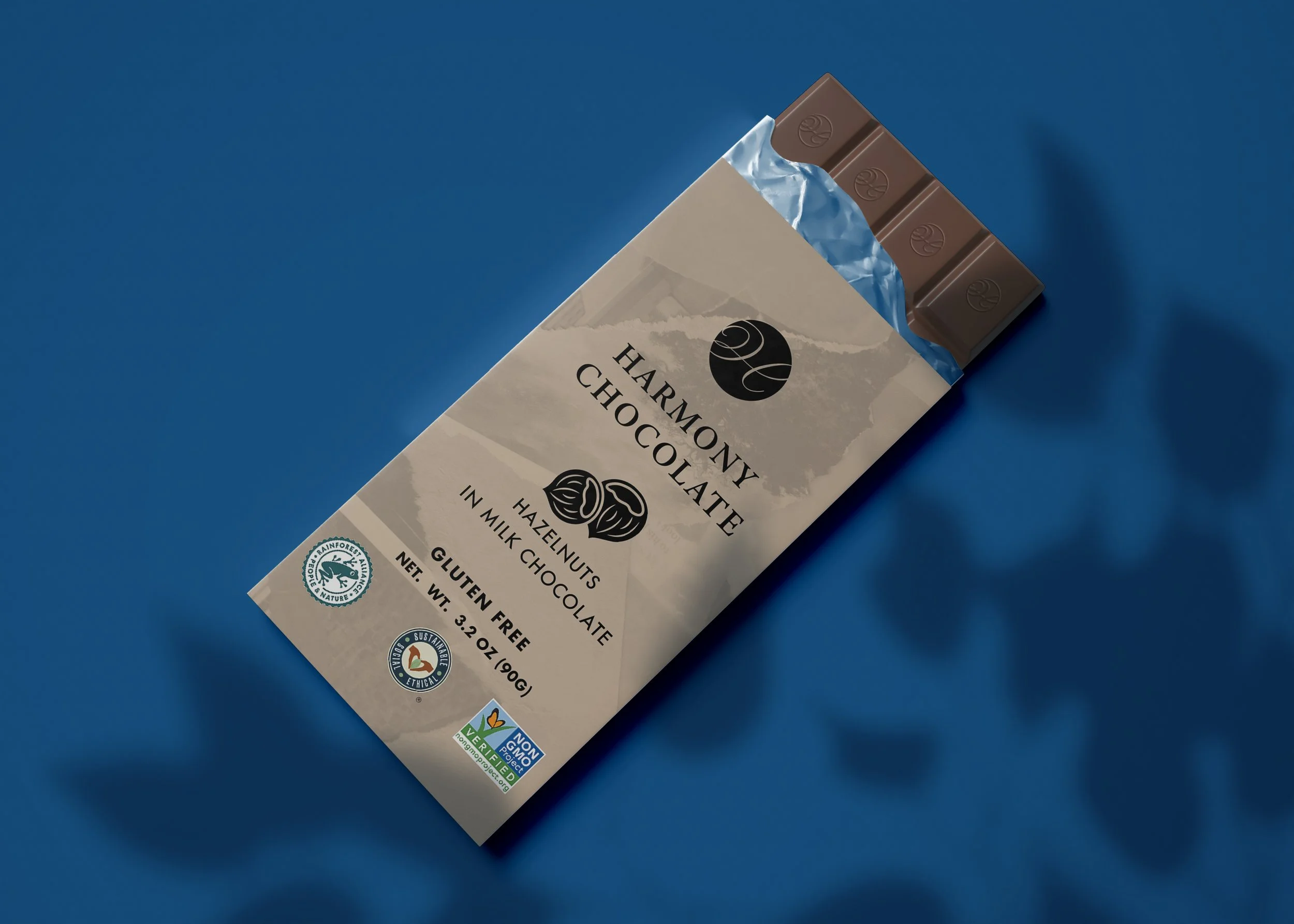
For Harmony Chocolate, I focused on a brand identity that feels calm, modern, and balanced. The idea of “harmony” is reflected through clean typography, minimal structure, and layered collage elements that create visual movement while still feeling cohesive.


Packaging System
I developed a consistent system across all three wrappers. Each design follows the same layout structure, including logo placement, flavor name, collage imagery, and informational panels. While the structure remains the same, I used slight variations in imagery and composition to differentiate each flavor.