
Napoleon Dynamite
Design System overview
Color Palette
I kept the whole palette warm — amber and orange as the hero, anchored by a deep espresso brown, a muted steel blue, and notebook cream. Every color I chose is a direct reference to the film's 2004 visual world. None of it is accidental. It all comes from the movie itself.
I worked with


Typography
I used three type registers intentionally. The chunky retro display font handles all the big titles — it's pulled straight from the original film. A loose handwritten font carries the chapter lists, because that felt like something Napoleon would actually write. And justified serif handles the body copy. Each one has a clear job and doesn't step on the others.
Texture & background
Notebook paper is the design's backbone. I used it on eight of the twelve booklet pages because it was the most direct way to put the reader inside Napoleon's world without saying a word. It's not decoration — it's the concept. Everything else sits on top of it.
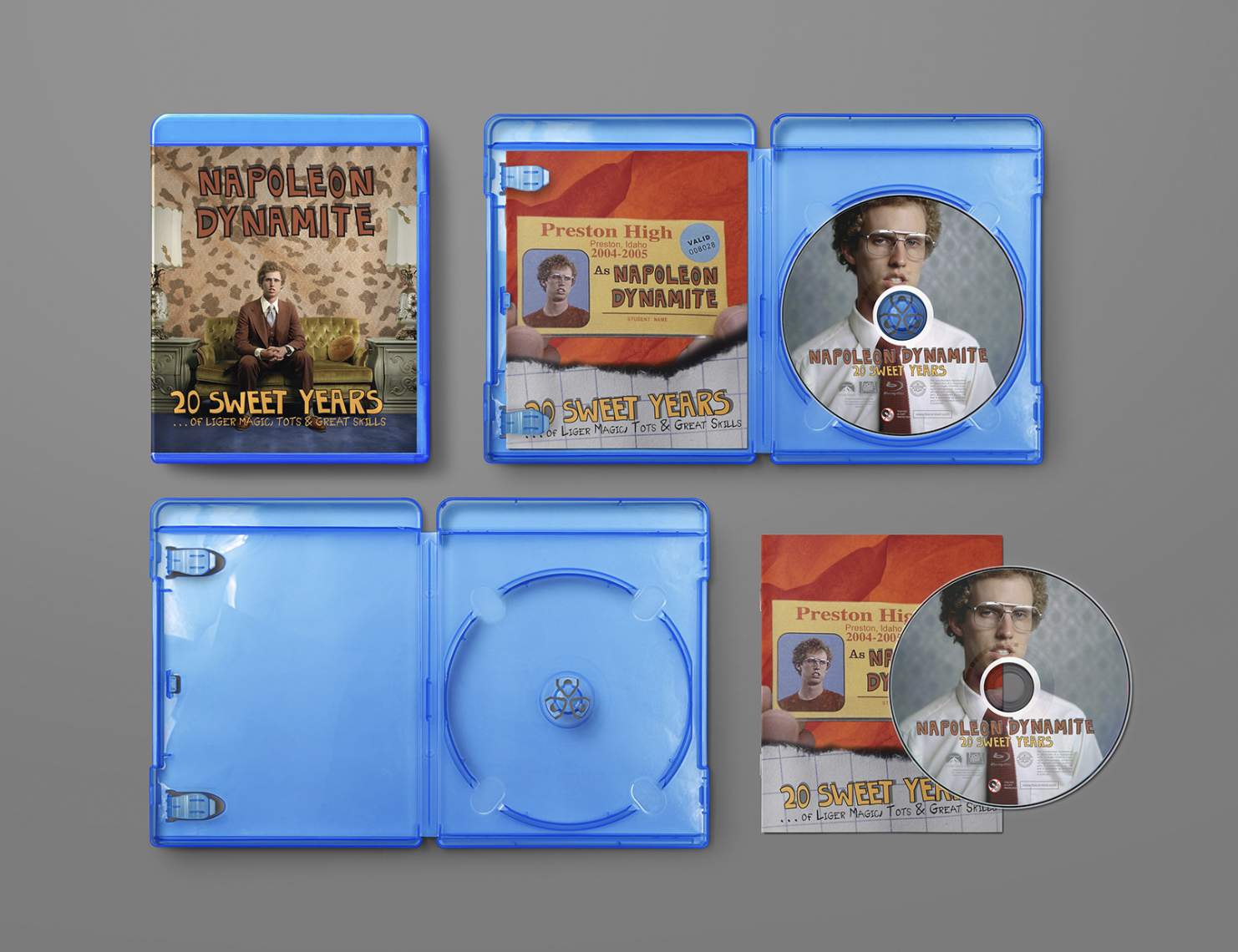
Blu-ray case & disc label
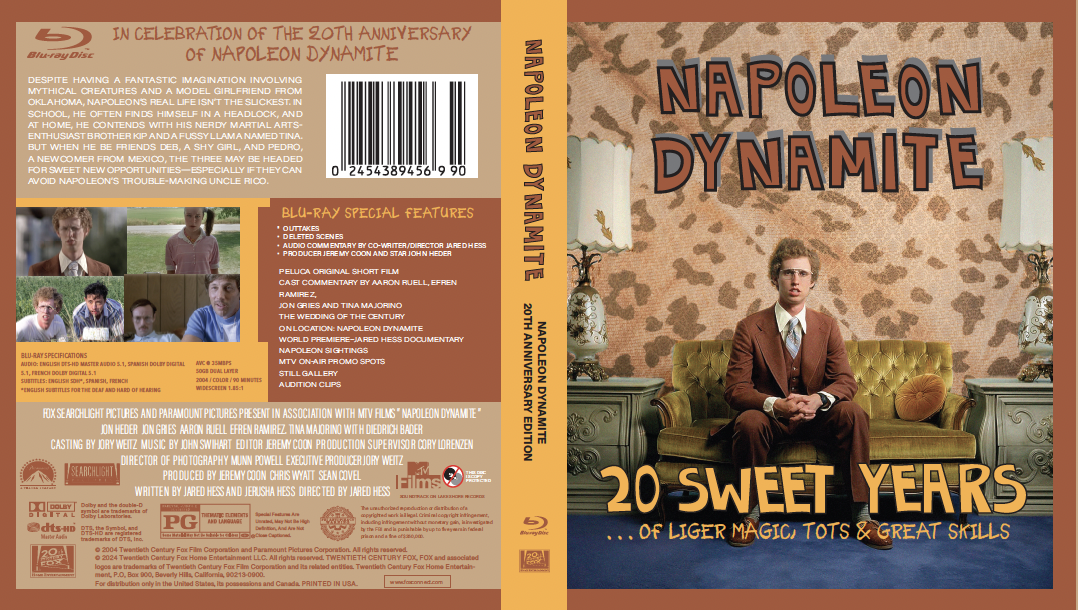
Napoleon is shown in the Blu-ray outer cover wearing a brown suit and sitting on a carved wooden chair in a glamour shot-style image that is evocative of Deb's Glamour Shots sequence. Napoleon wearing a red tie and white dress shirt is depicted in a circular crop on the disk label, along with a simple title treatment.
The front cover image is visually striking, blending humor and dignity while using warm tones to create a cohesive, cinematic aesthetic.
The packaging layout is well-structured, with a clear division between functional information and bold visual design, unified by a consistent color palette.
The disc label is simple and elegant, effectively using circular composition and typography that respects the disc format.
The back panel organizes dense information clearly, maintaining readability while using consistent design elements like a handwritten font for visual cohesion.
Booklet Concept
Front cover & insert
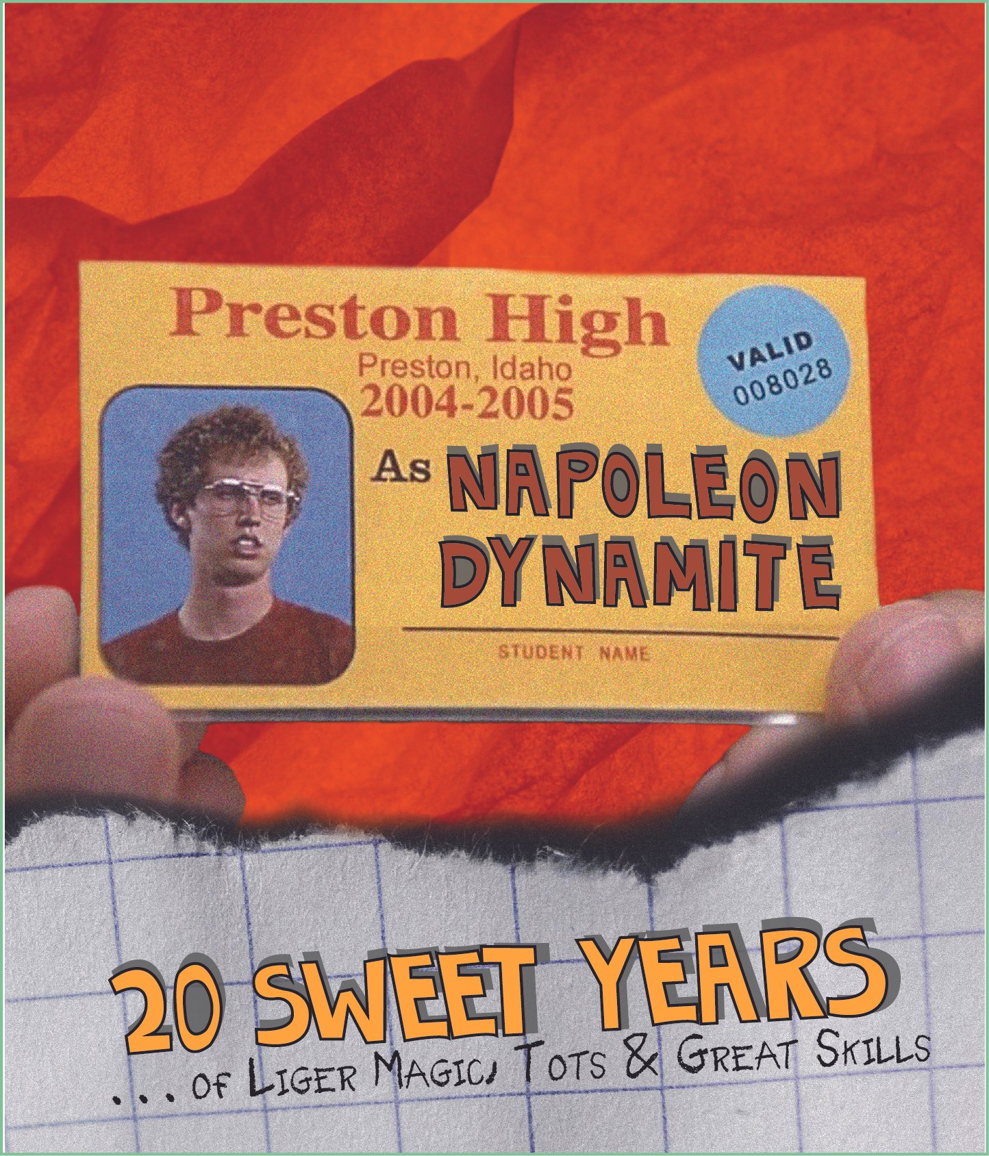
The cover is built around Napoleon's Preston High school ID held up against a crumpled orange background with a torn notebook paper section at the bottom. It doubles as both insert and Blu-ray front panel.
The school ID as the hero image is a strong, instantly recognizable choice that communicates the concept clearly and evokes nostalgia.
The torn notebook paper texture effectively reinforces the school theme and creates cohesive visual storytelling.
The “20 Sweet Years” title treatment successfully reflects the film’s retro style while maintaining authenticity to the original design.
The subtitle uses familiar references and humor from the film to engage fans and strengthen emotional appeal.
Pages 2–3 · The making of Napoleon Dynamite
These spreads tell the story of how director Jared Hess grew from a BYU film student shooting a 2002 short called Peluca to premiering a surprise hit at Sundance. The layout uses a notebook-paper background texture throughout, anchoring every page in Napoleon's world.
HEX: #EF9F27

HEX: #3d2200
HEX: #7a8fa8
HEX: #C85A30
HEX: #f5eecb
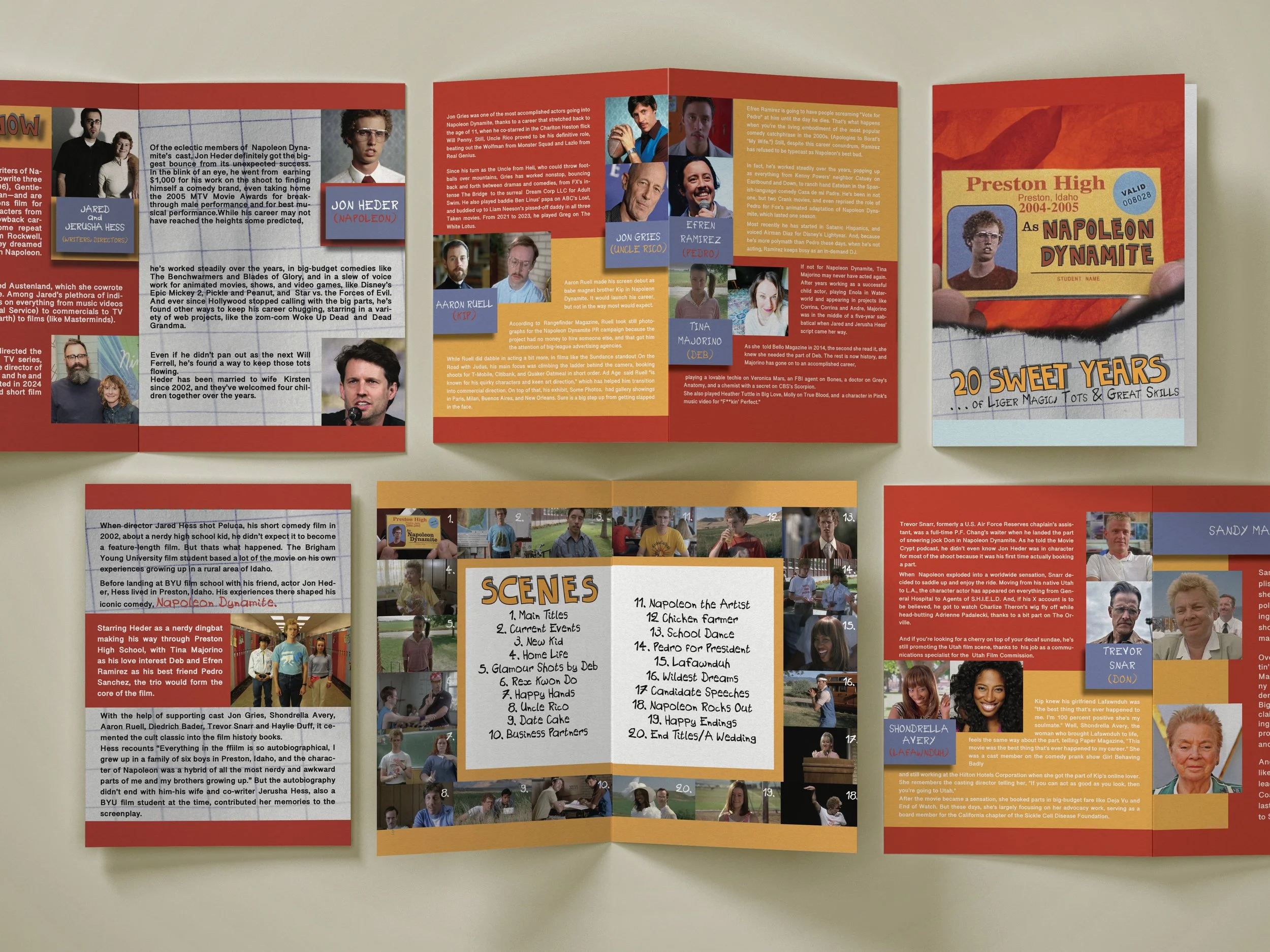
Pages 4–5 · Scene gallery
Two spreads presenting all 20 chapter titles alongside corresponding film stills, numbered and arranged in a collage-style grid. The scene list ("Glamour Shots by Deb," "Rex Kwon Do," "Uncle Rico") is presented in a handwritten font on a cream background block, surrounded by the stills.
Pages 6–12 · Cast career retrospectives
The second half of the booklet profiles every major cast member with a "then and now" format — a film still alongside a recent photo, with a character name badge and a career retrospective. The profiles cover Jared & Jerusha Hess, Jon Heder, Efren Ramirez, Tina Majorino, Jon Gries, Aaron Ruell, Haylie Duff, Diedrich Bader, Trevor Snarr, Shondrella Avery, and Sandy Martin.