
Passion Fruit
Style Guide
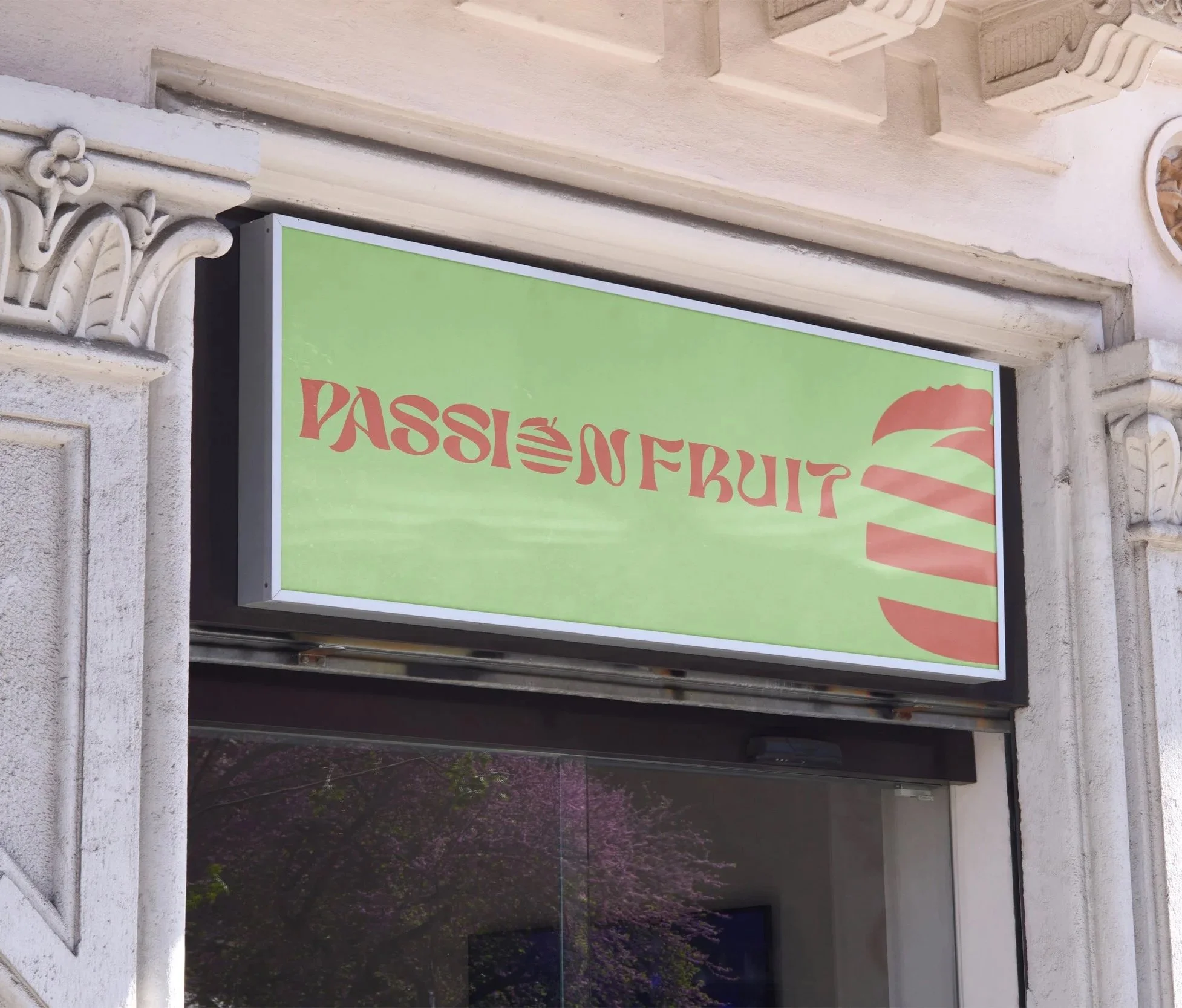
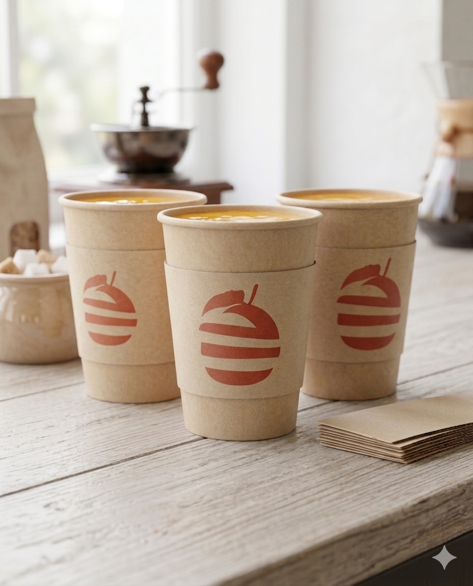
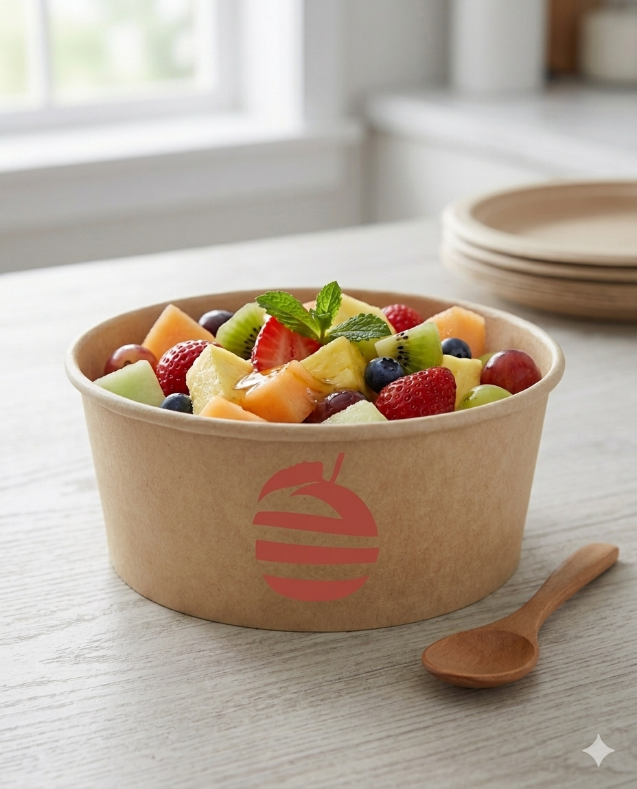
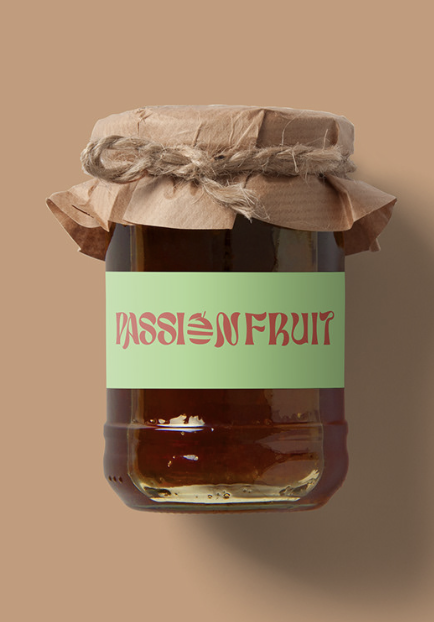
Passionfruit is an establishment that primarily serve organic smoothies of various type of fruit will be have on the menu. All ages are welcome to try our smoothies which will be offering and the base can be make with these two preferences: water or milk. Also, we will serve other healthy items in many simple ways with our delicious fruits such as fruit bowls, fruit salads, fruit snacks, fruit jams, etc.
The message we want communicate to our audience is they can definetely enjoy all the varieties of fruits and the healthy items we are offering. Feel their happiness for fruits is our purpose.
Typography
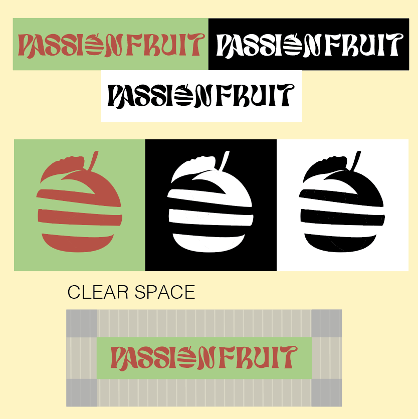
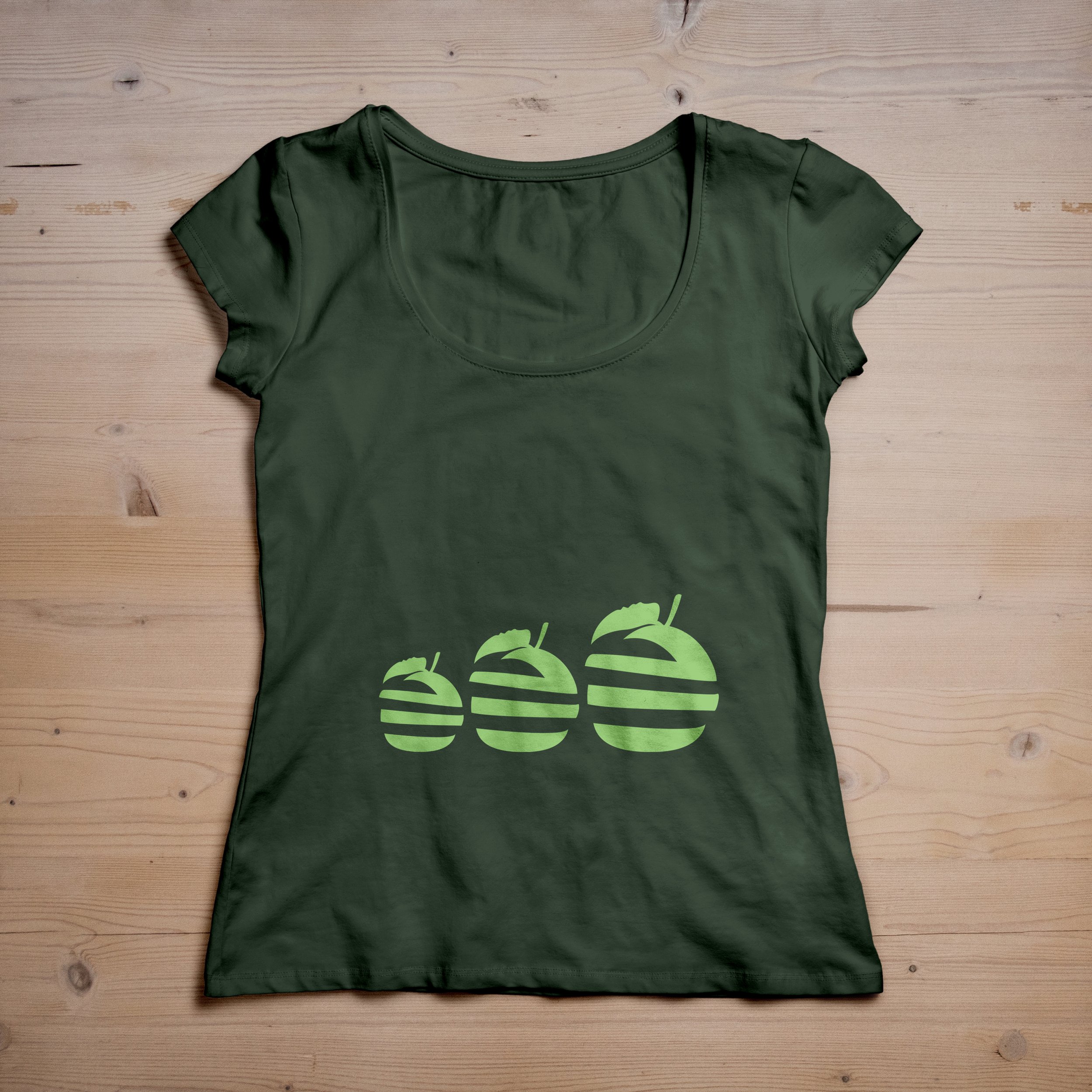
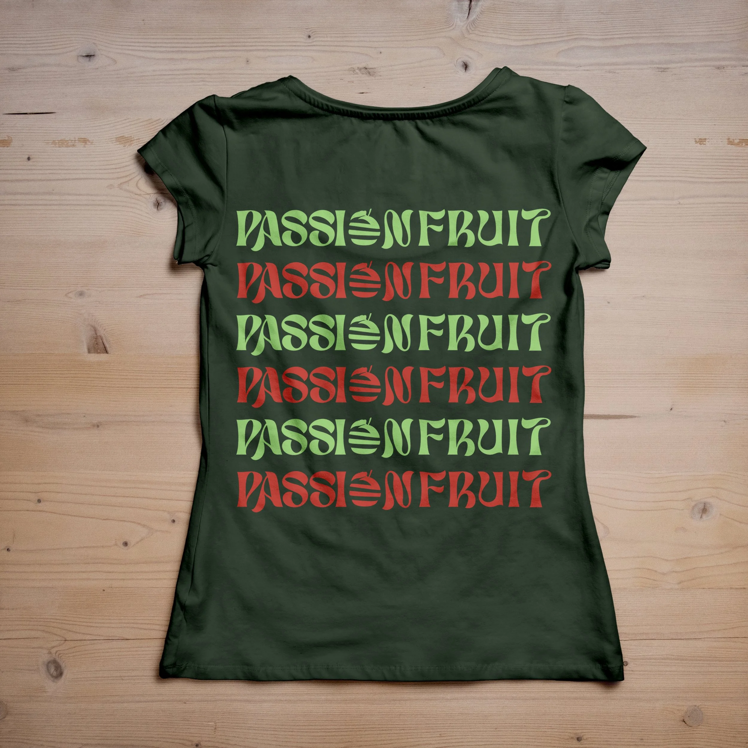
The font I found was on Dafont.com and the name of the font I used was Lostar. I liked the style of the font because was simple and good consistent as a text and a figure like almost a handwritten but just thicker and curvy. Also, I chose this color palette because it emphasizes a good combination of nature, growth freshness, and energy like on the color is a light tone green is representation of the fruit orange which it brings harmony, and the color is a medium tone red-orange associated with energy, joy, and happiness.
Brand Signage
Selling products
Color Palette

C=0
M=79
Y=69
K=22
C=40.92
M=0
Y=66
K=0
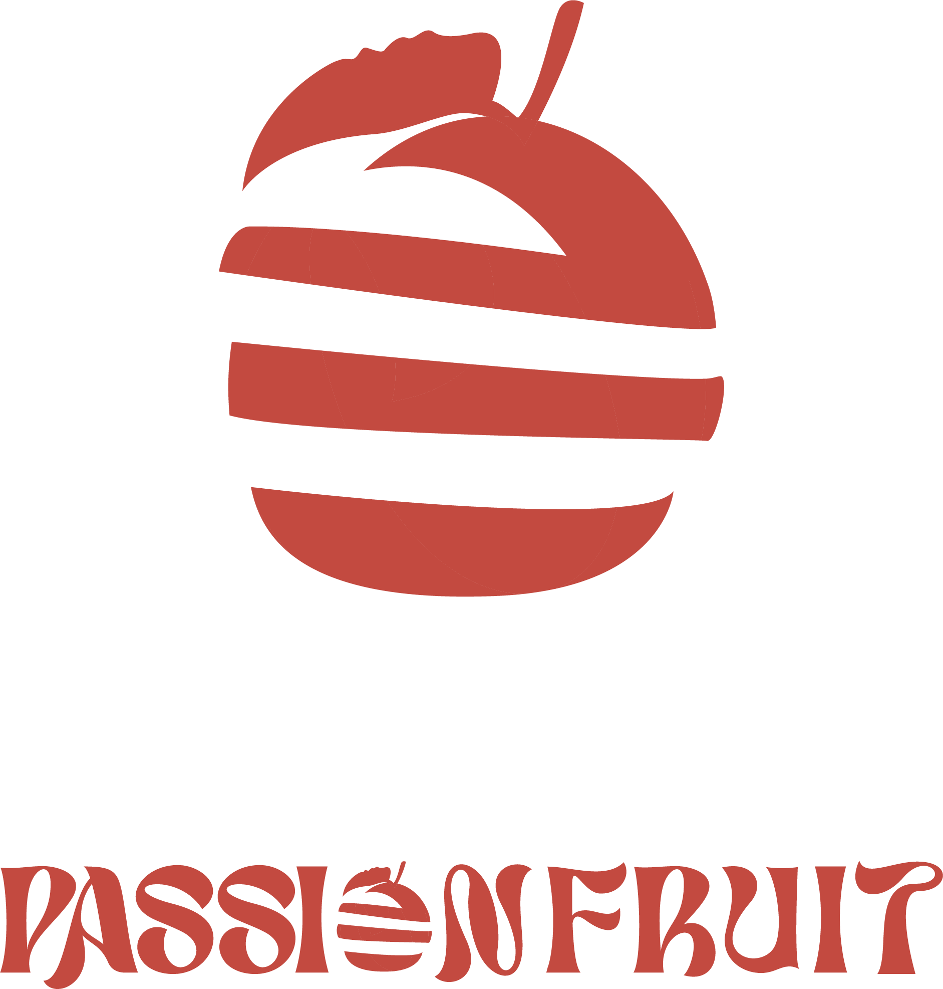
Logo
Logo Name
Merch
Food Truck
