Website Design
I created Rembrandt’s Table inspired by Amsterdam’s rich cultural heritage and Rembrandt’s artistic legacy, aiming to share the joy of authentic cuisine with both locals and tourists. I envisioned a dining experience that feels like an extension of the city’s creative energy, blending history with modern tastes and sustainable, locally sourced ingredients. I focus on warm hospitality, canal-side charm, and a visual identity rooted in earthy tones and Dutch artistic tradition.
Rembrandt’s Table
Typography
Superclarendon - Light
A fantastic option for projects looking for a timeless yet whimsical or vintage-inspired design since it strikes a balance between tradition and charm. It works especially well for branding, headlines, posters, and any other situation where you wish to blend personality and impact.
Futura - Condensed Medium
It complements modern and minimalist design styles with its crisp edges and exact geometry, which radiate clarity and sophistication. frequently linked to sophistication and professionalism, looks stunning in headings, posters, signage, and any other situation that calls for a striking yet tasteful typographic statement.
Iconography

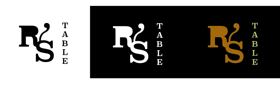
Logo
I worked with


Mock Ups
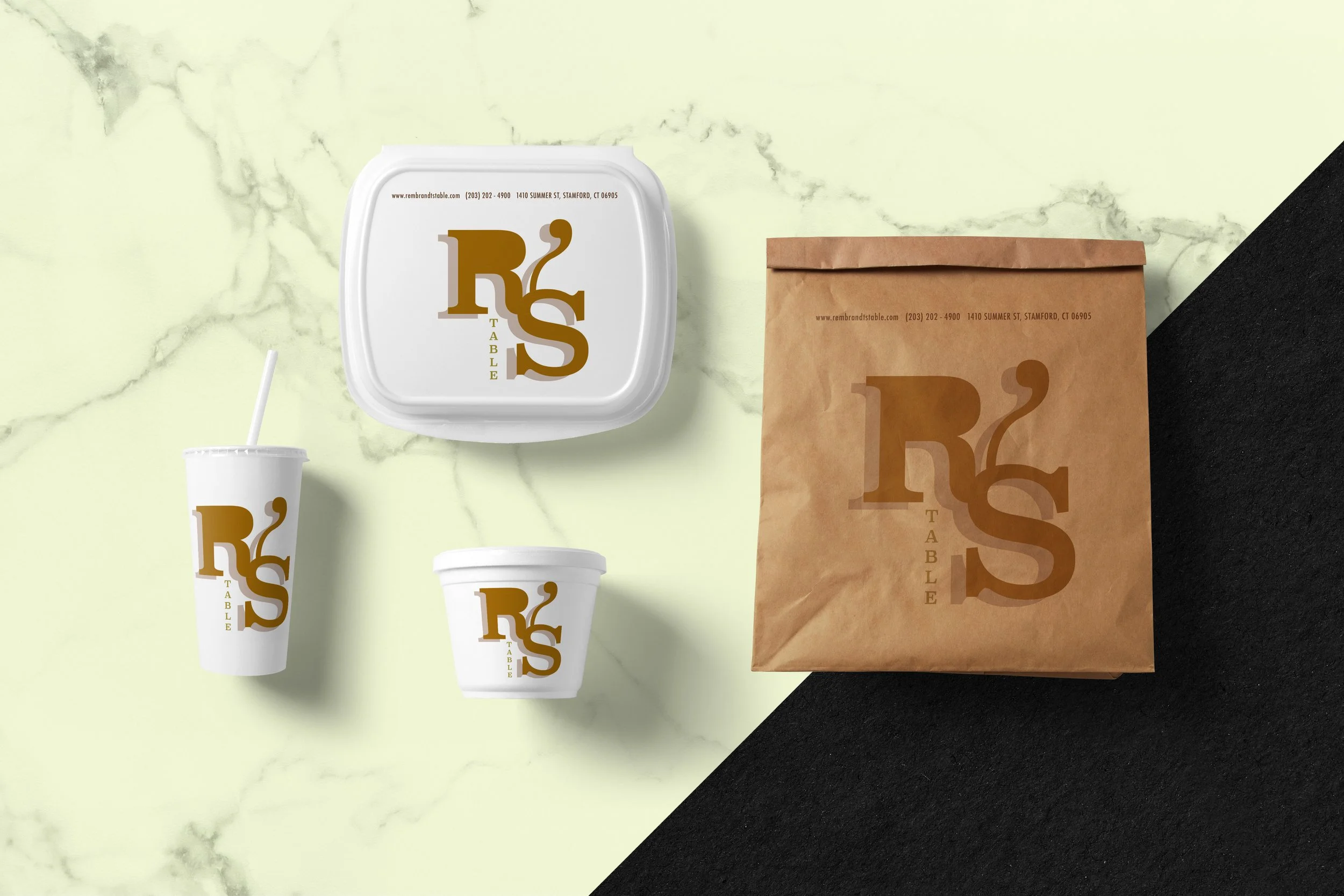
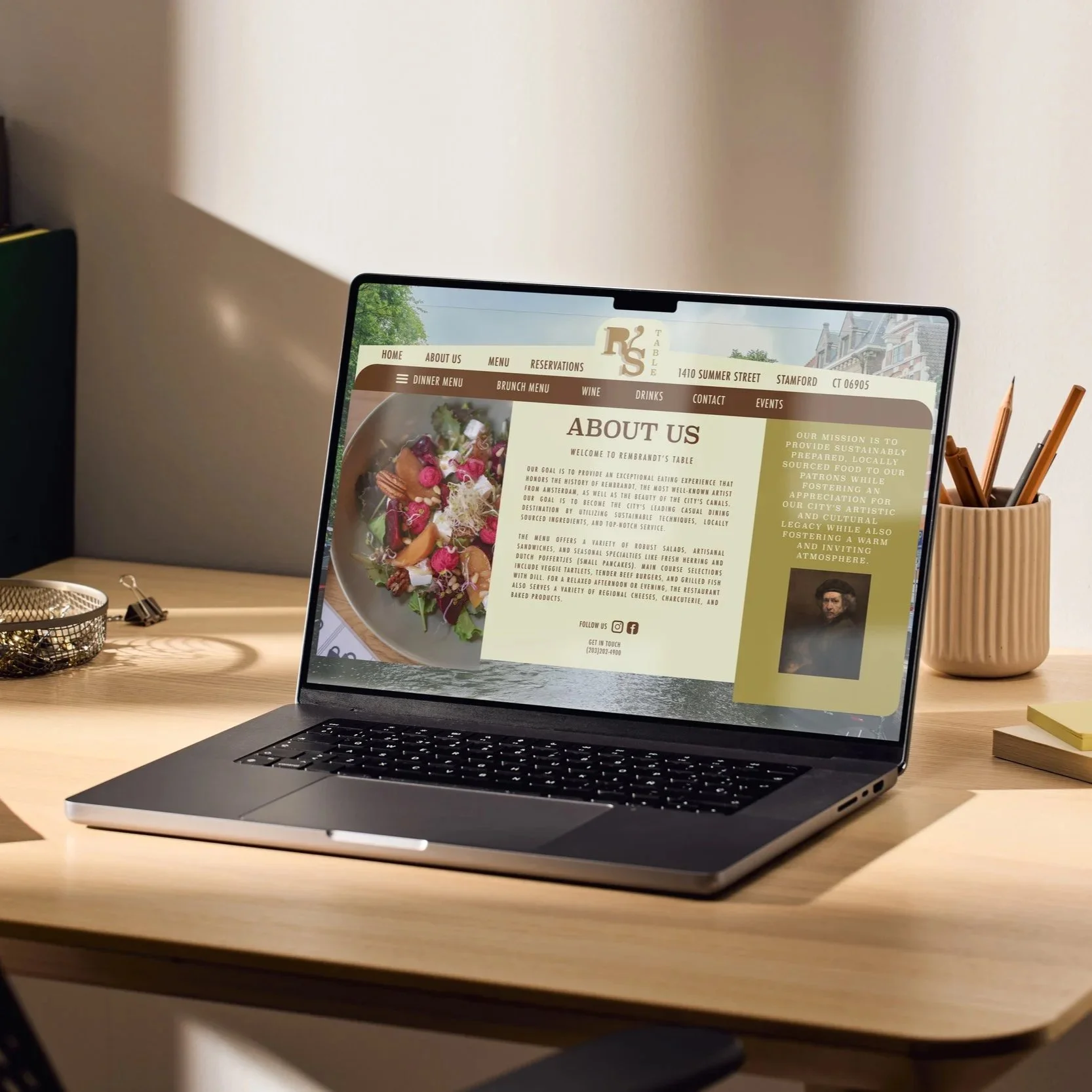

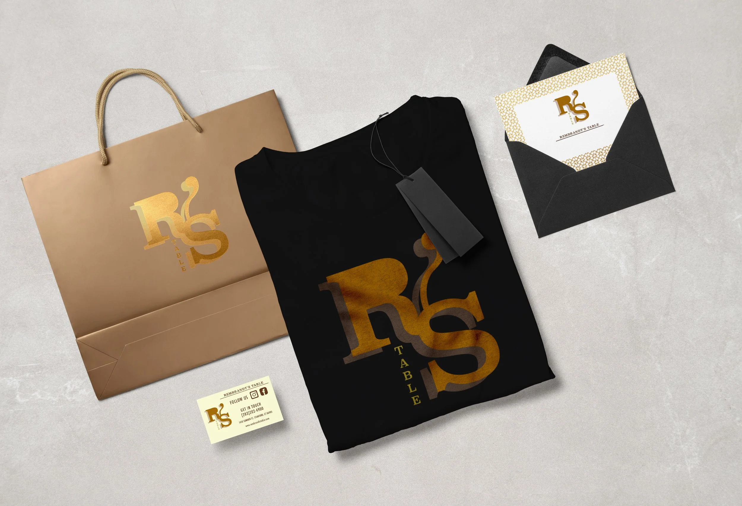

Image 1 · Brand story & mission
This website introduces Rembrandt's Table, a restaurant rooted on Dutch culture and the life of artist Rembrandt van Rijn. In a straightforward three-column layout with an image of the Amsterdam Canal in the backdrop, it includes a purpose statement, a synopsis of the menu, and contact information.
The Amsterdam canal background strongly establishes the restaurant’s Dutch identity and creates an immersive first impression.
The three-column layout is organized effectively, giving each section a distinct purpose without overwhelming the page.
Including Rembrandt’s portrait adds cultural depth and artistic authenticity to the restaurant’s branding.
The food photography is warm and appealing, helping balance the page visually and enhance appetite appeal.
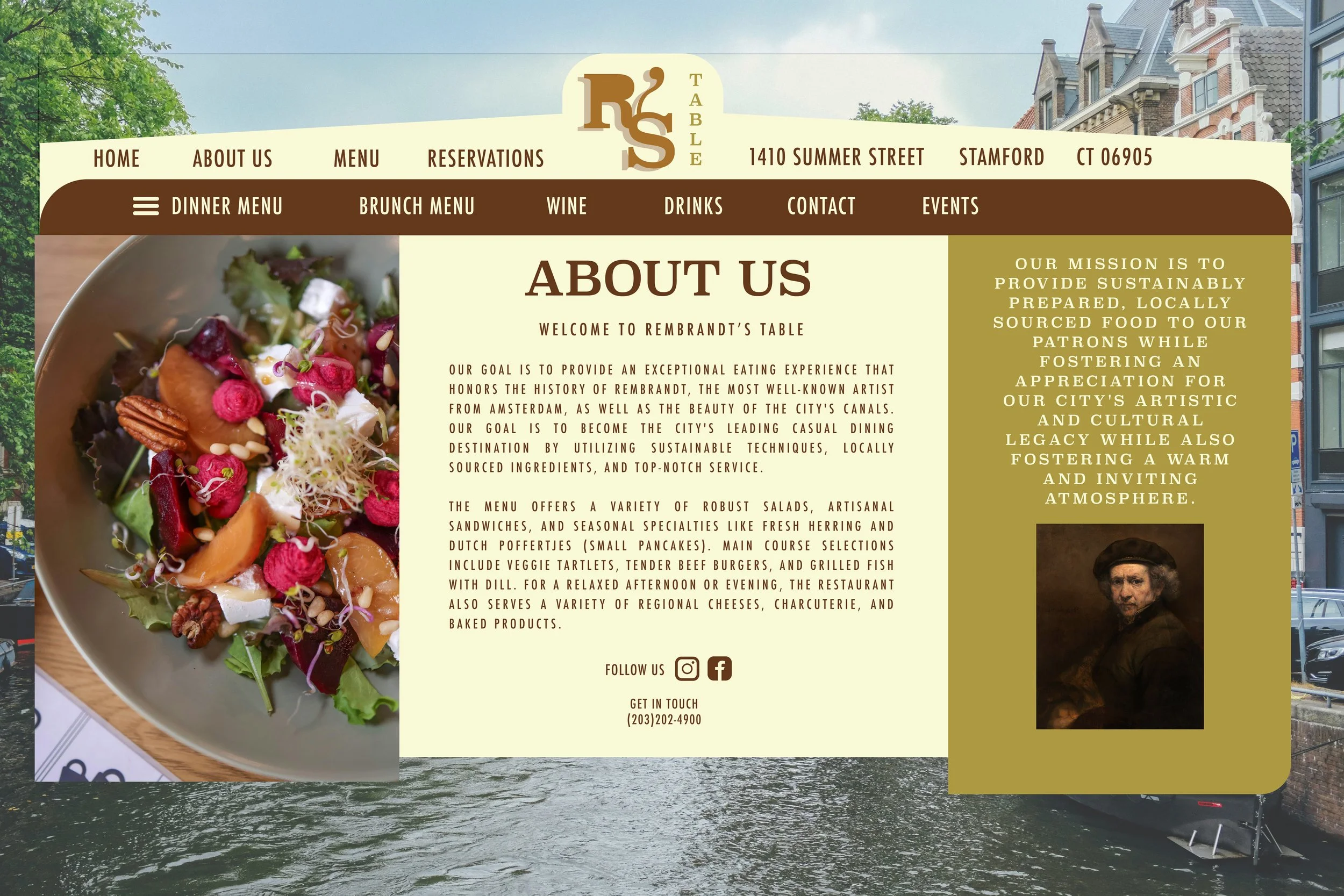
Image 2 · Specials, chef features & booking widget
This is the site's functioning core. On a single screen, it displays chef specialties (Moules Frites, La Crema Pinot Noir), the day's specials (Brunch Drinks & Plates), and a live reservation widget with date, time, and party size options.
Combining specials with the reservation feature creates an effective user experience that encourages immediate booking decisions.
The “Special of the Day” badge stands out visually, drawing attention to important promotional content.
The “Check Availability” button is highly effective due to its strong contrast, clear labeling, and prominent placement, improving conversion potential.
The cocktail and food photography feel premium, authentic, and visually reinforce the menu offerings effectively.
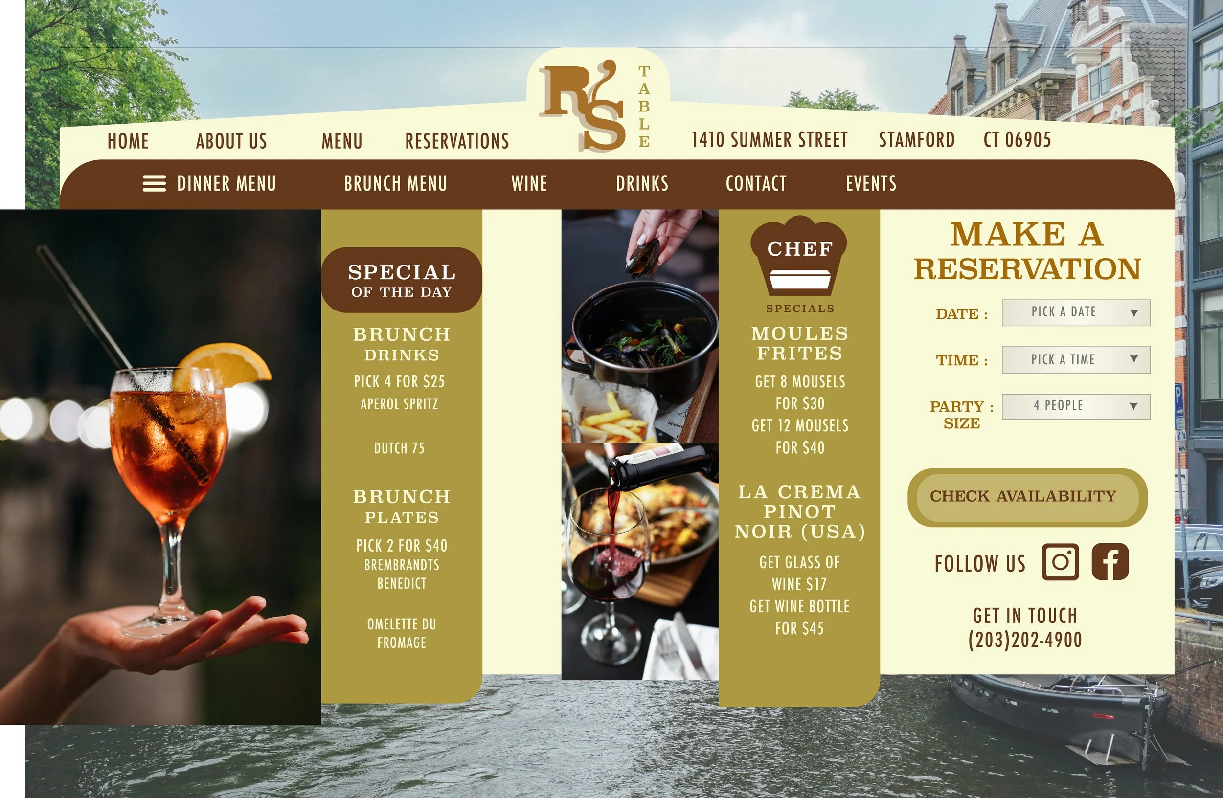
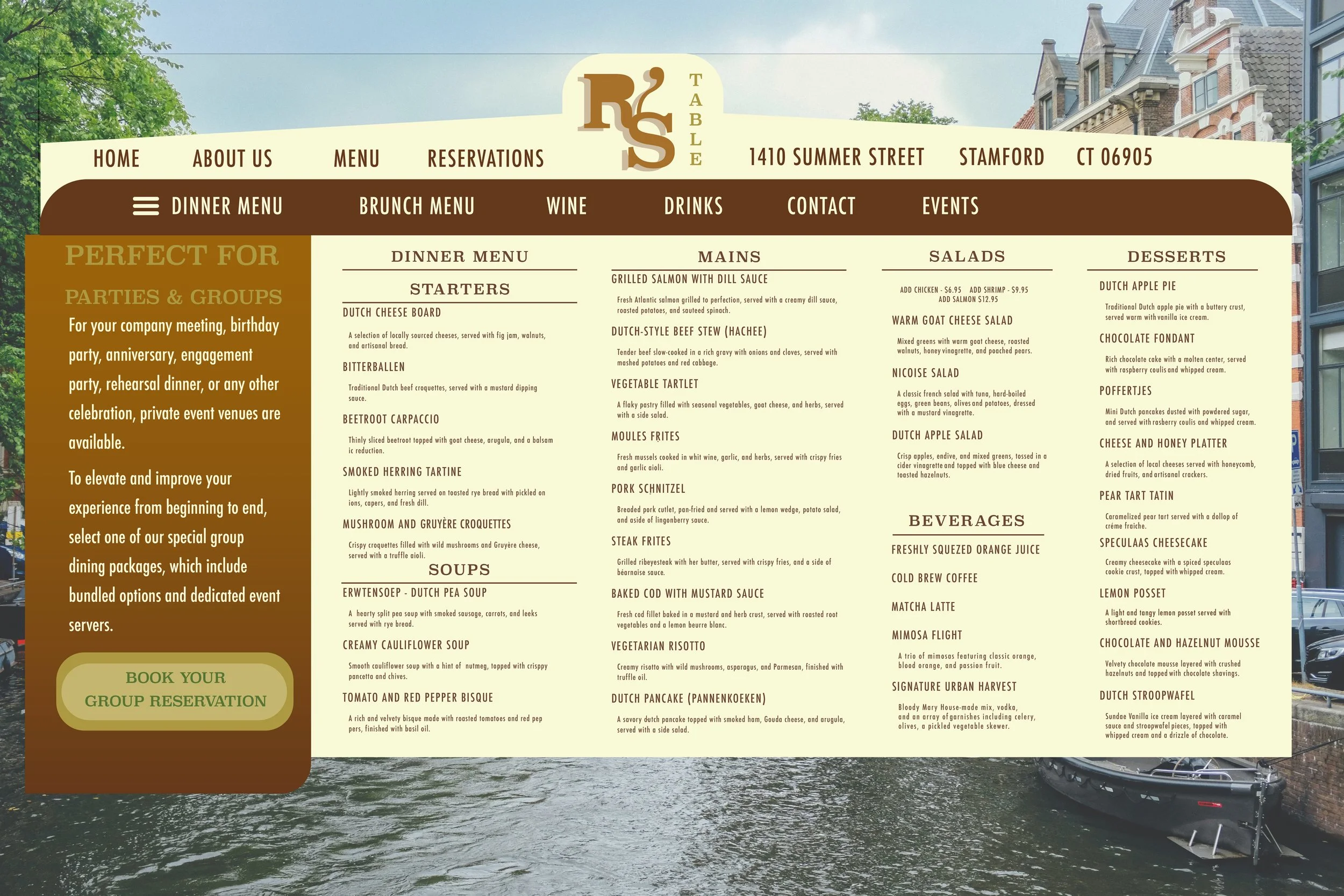
Image 3 · Full dinner menu & group dining
Along with a sidebar for group reservations, this site displays the whole dinner menu in a thick multi-column style, including starters, soups, main courses, salads, drinks, and desserts. The menu is wide and includes anything from desserts like Chocolate Fondant and Pear Tart Tatin to traditional Dutch dishes like Bitterballen and Erwtensoep.
The menu offers a wide variety of authentic Dutch dishes, creating a genuine cultural dining experience.
Brief descriptions for each item make the menu approachable and easy to understand for new diners.
The group dining reservation section is strategically placed, helping event planners quickly assess accommodations.
The dessert selection successfully balances traditional Dutch favorites with familiar international options for broader appeal.