
Design Concepts Inspired by
WAKU TEA
Feeling genuinely inspired, I took the initiative to develop three original design concepts by using Waku's website with existing visual language and brand elements.
I worked with


My Redesign
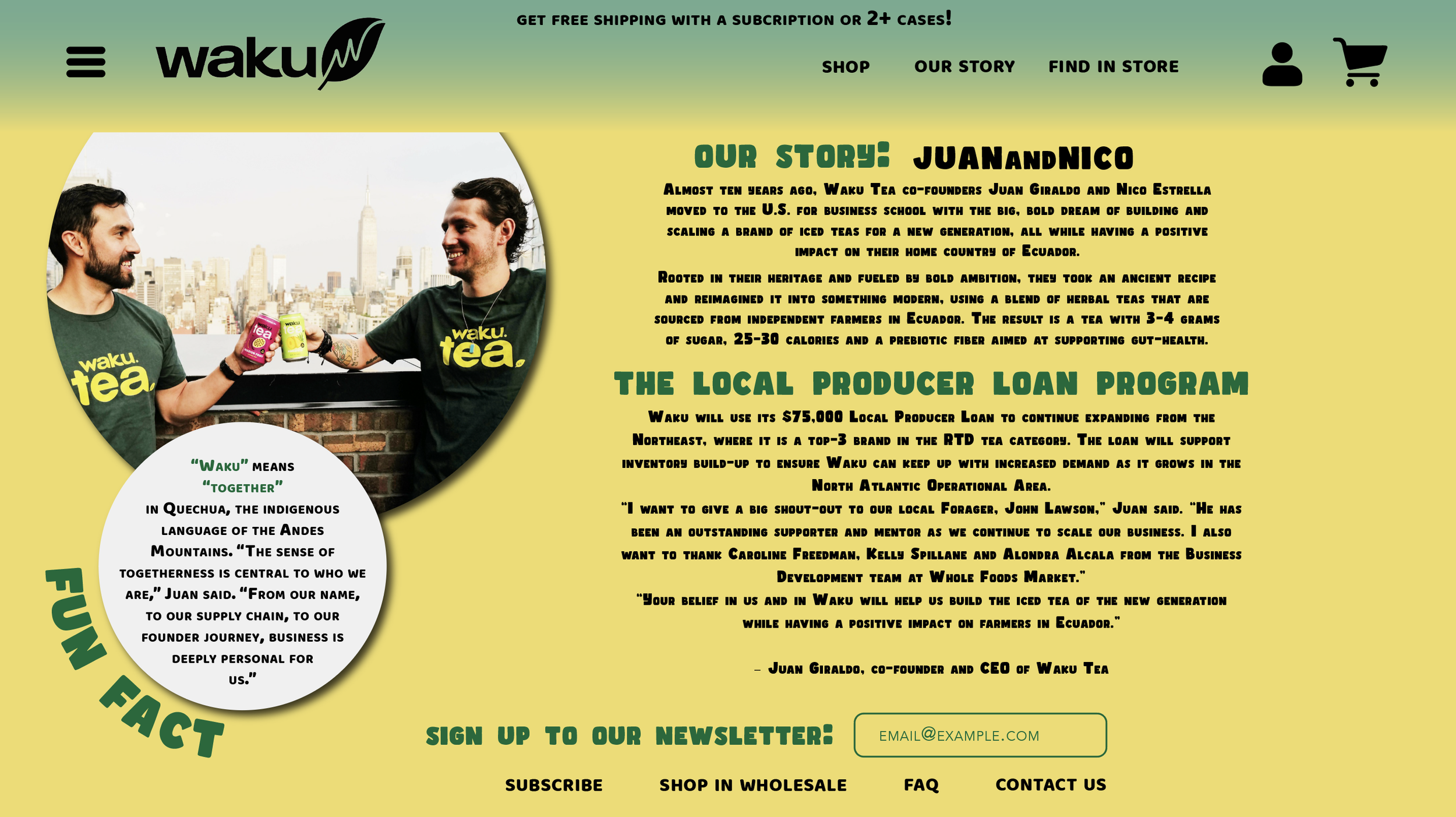
I highlighted the $75,000 Whole Foods Local Producer Loan Program to reinforce the brand’s credibility, transparency, and mission-driven identity. Including the CEO’s quote added authenticity and emphasized community impact. I used all-caps serif typography for a distinctive style and incorporated a “Fun Fact” sidebar to create a more engaging reading experience.
Through the stories of co-founders Juan Giraldo and Nico Estrella, I created a human-centered brand identity rooted in Ecuadorian culture and social impact. By highlighting their mission, background, and connection to the Local Producer Loan Program, I aimed to make the brand feel authentic, approachable, and culturally meaningful while distinguishing it from competitors.
Waku’s Original Website

My Redesign
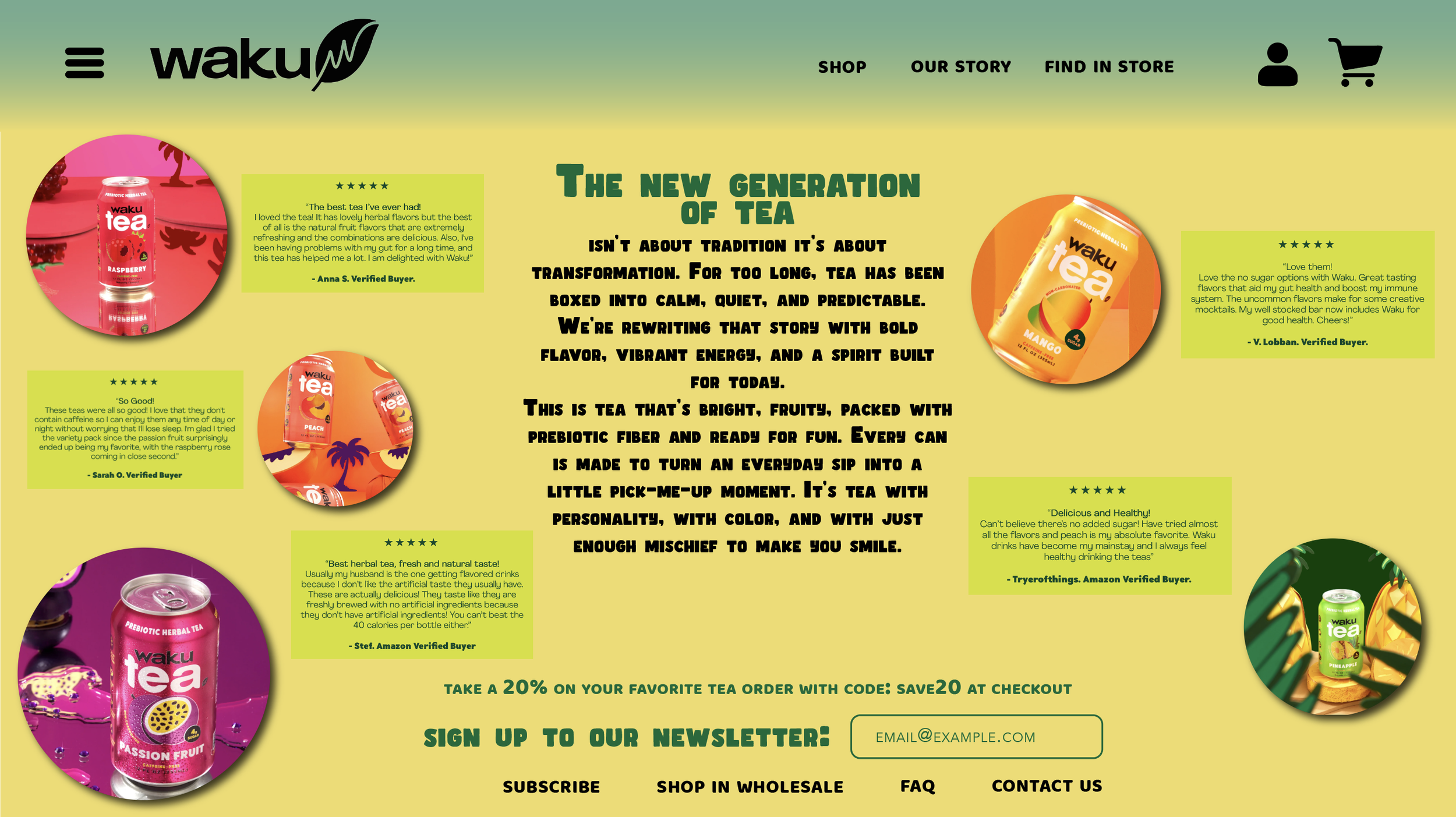
In this page, I combined product photography, customer testimonials, and the statement “The new generation of tea” to create a modern editorial-inspired design. I used circular imagery, asymmetric layouts, and centered typography to communicate the brand’s energetic identity, while verified customer reviews helped reinforce authenticity, credibility, and consumer trust throughout the composition.
I used bold product photography and vibrant colors to emphasize the brand’s tropical and energetic identity. I strategically placed the 20% discount CTA before the newsletter signup to encourage engagement. While the layout feels visually dynamic, simplifying some elements and improving review visibility could enhance readability and user experience, especially on mobile devices.
Waku’s Original Website

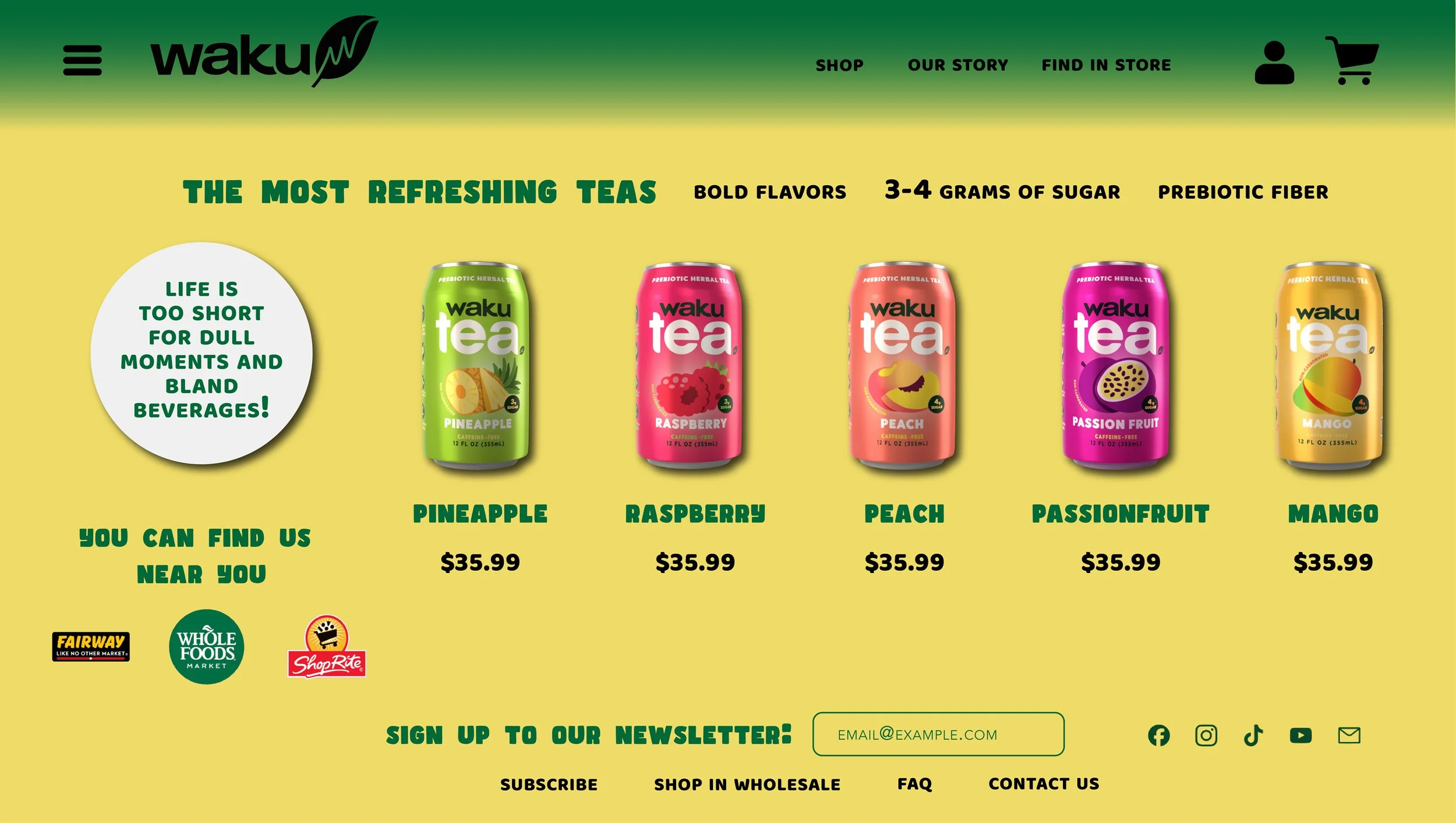
Waku’s main storefront page features a bold yellow-green backdrop showcasing five flavors—Pineapple, Raspberry, Peach, Passionfruit, and Mango—alongside a $35.99 case price. The crowded above-the-fold layout boosts product visibility. Energetic tropical colors reinforce freshness, while clear navigation guides shopping, storytelling, and store discovery. A bold tagline and circular design enhance personality.
My Redesign
Highlighting well-known retail partners builds credibility and increases consumer trust. Consistent pricing across products simplifies decision-making but may lessen perceived differentiation.
Waku’s Original Website
